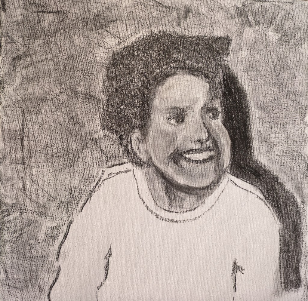
I begin today to work on more portraits. It is quite an emotional journey I’m on and some of these portraits are now hanging in my studio. As I walk into the space they are looking at me and in a strange way they are compelling me to continue. It seems a bit surreal the connection I have with these children. I just have to do them proud. This first one for part four is not easy as this poor little boy had over 100 injuries. He has such a beautiful face but I’m going to do this one a little differently. I want to almost cover the canvas with his face. My canvases for these portraits are all 16x16inches. I’m just going to undertake this one in charcoal. Although I did use colour on three others I will see how they look visually when I try hanging them. Just a dash of colour may look okay and the ones with the colour do denote significant landmarks. For example the first death which was D, then V who transformed the private fostering arrangements and S, killed by women. I shall hang these on the side of the house as there is space for about 25 and I have some special sticky tape that will work. 5×5 gives me a square and so does 36, 6×6 and that is what I shall aim for.
After meeting with the ethics committee and a lot of soul searching some of the more recent portraits will not be exhibited. I shall just show either six or eight in contrast to the above.
I begin to draw the outline of the face and to almost fill the canvas. I am constantly considering other artists drawings and the one that comes to mind when I go bigger is the work of Marlene Dumas as the head fills the canvas.
I include her drawing below titled Lucy. She has a cut to her throat.
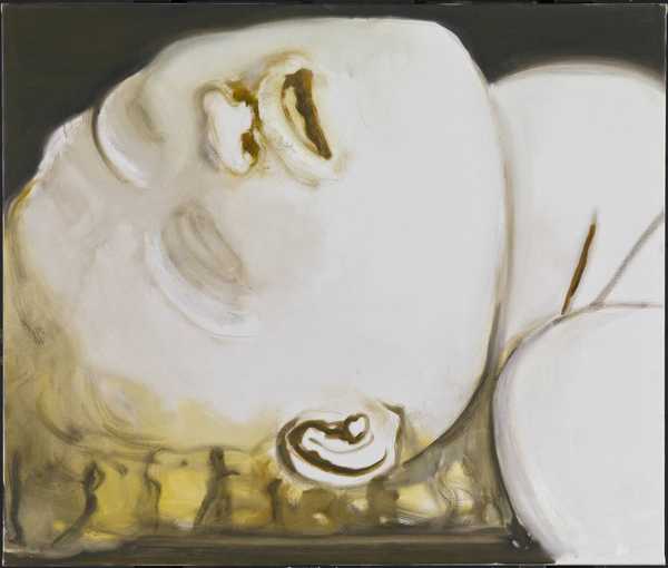
It is from the Tate website. The way the face is so close to the viewer adds to the seriousness of the subject and does evoke an emotional response. It is quite serene. I researched Dumas extensively and I really appreciated how she captured the emotions in her drawings and paintings and how she uses colour. Dumas is a contemporary South African artist and was born in 1953.
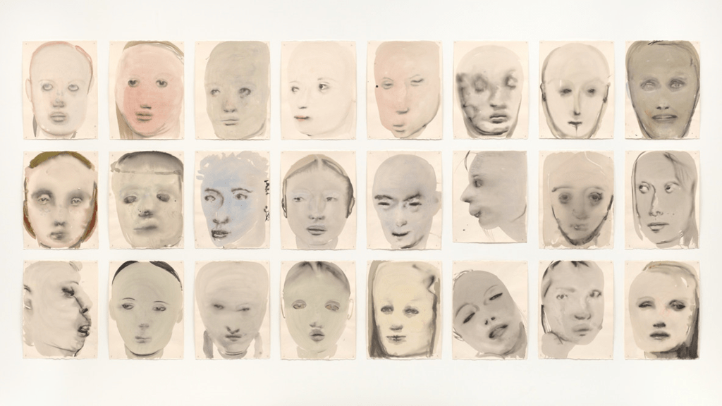
The work below is called Chlorosis (love sick and was completed in 1994. This is how I anticipated displaying my portraits on block. https://www.moma.org/collection/works/37856
Even though she has used colour the figures are very sombre, some emotionless but she’s captured their expressions so well. Dumas uses a range of methods and a lot of her work can be politically driven. She has a catalogue of journalistic photos and news reels. She also uses family and friends photos for reference. Her painting’s such as the ones below are in thin washes and in this one she used a wash of green. Dumas wants her imagery to be “grounded in reality.”3 For Dumas, “painting has to show its method, how it becomes what it is; [it should] move back and forth from the ‘illusion’ to the ‘gesture.’ The MOMA website states further that ‘A Dumas painting is an orchestration of sensations, confronting the viewer both with boldness and tenderness: matte and reflective surfaces, wet and dry contours, neutral and poignant tones all attend to the volumetric nature of the body. Transmitting bodily sensations is a tactile matter, articulated by following one’s hand and intuition.’ You can actually see the wet into wet techniques and her methods and the transparency of the faces add to the mystery and what we feel in her work.
Having really appreciated her work I still have to put in context with my own and as I’ve started with the charcoal I feel it is more suited to my work at present. Although colour does alter the temperature the subtle colour and transparency in Dumas’s work would apply to my subjects well, however I am completing them in a happy pose. I believe the darkness of the charcoal helps signify their deaths so I will stick with this.
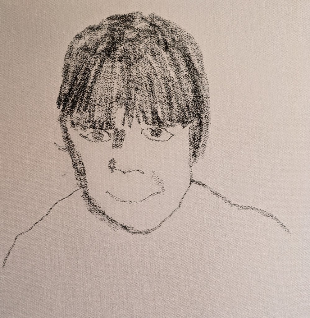
The first outline of my drawing is below.

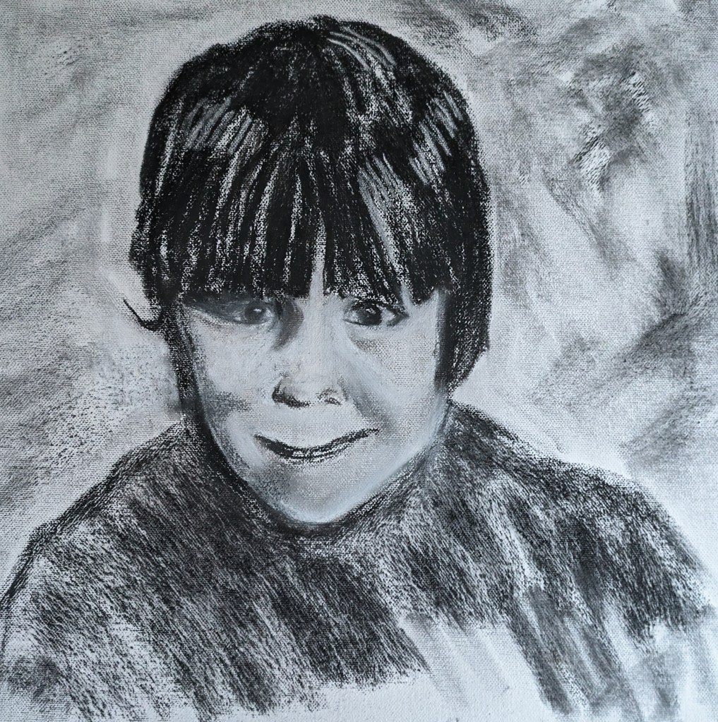
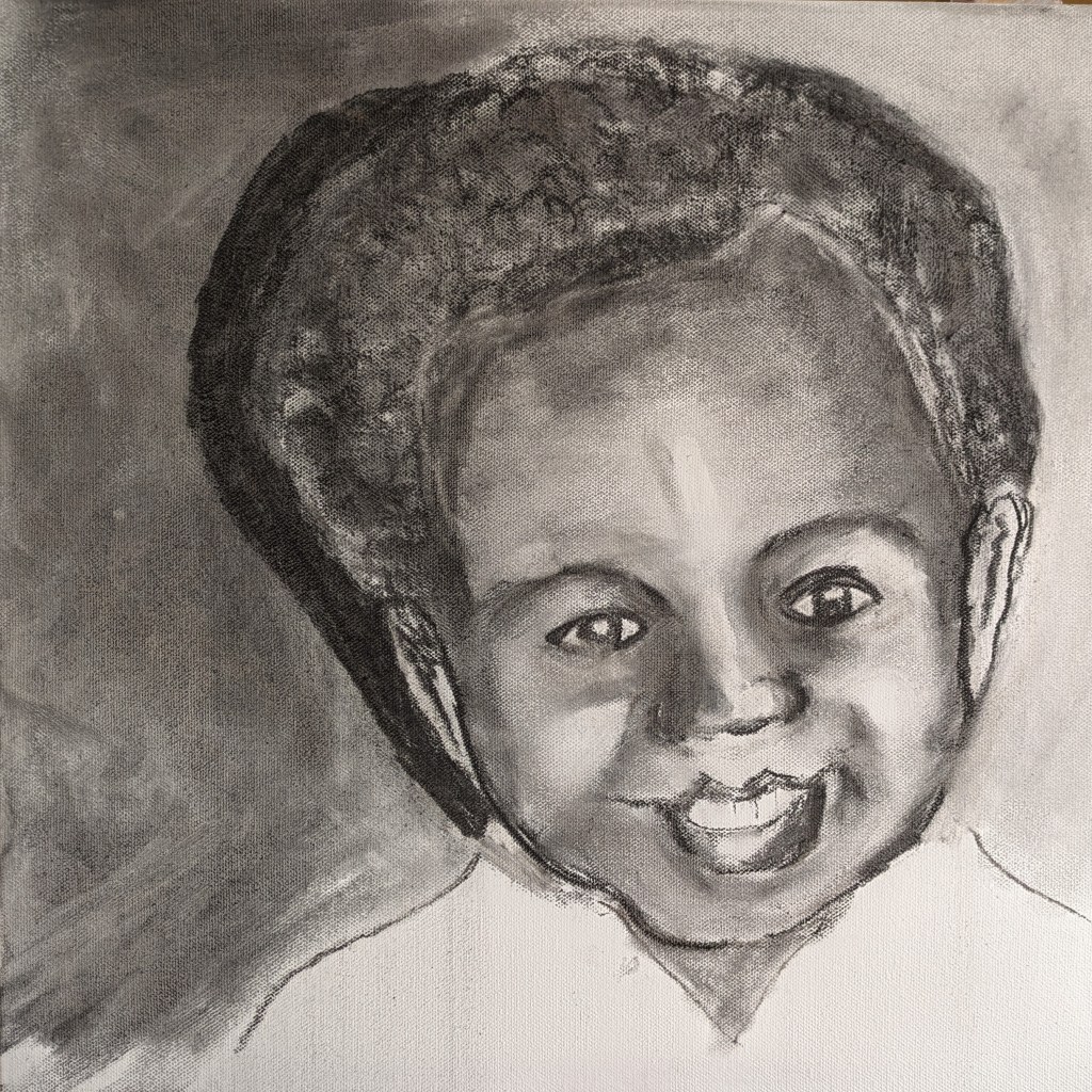
I do seem to have the outline fairly accurate so I then add more detail and build up the form in the face and features. The next drawing shows the eyes nose and mouth.

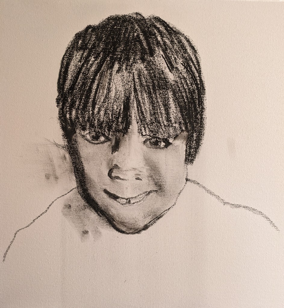
The next drawing shows the final image. I’ve revised the eyes and worked more on the nose. This was quite a challenge but I persevered. I further added to the hair. In the photo he has quite a quizical expression and he’s not looking at the camera. I think I’ve managed to capture this. I’m getting used to doing the eyes and I seem to be managing the direct gaze into the camera and ultimately, to the viewer quite well. Portraiture by the very nature of it is a very intimate thing to do and you can’t help but connect with your subject. I really do feel I know this little boy.

The next drawing is of a seven year old girl.
I begin by drawing the main features and outline of the face and body. Her hair is quite prominent and hangs just above the eye line so I block this in quickly. The first image is below.
I continue and see how the nose is a bit too wide and the eyes need some adjustment too. I keep working at this. She has quite a wry smile as she looks slightly up at the viewer. I can see in this girls eyes some of the damage incurred. Memories come flooding back. In the recesses of my mind I’m drawing on what I learned in the past from a specialist and writer on Child Protection, Jean Moore. She wrote the brilliant book, the ABC of Child Abuse. I remember how she described a child like this as displaying ‘frozen watchfulness.’ My memories become clearer as I focus on this portrait and as I connect in the materiality of my charcoal. Its interesting how my memories come flooding back. I learned such a lot from this woman and I was able to put a lot of what she taught me into practice when I trained foster carers. I must try to capture this particular look or gaze in her eyes. The next image shows the smile but the nose is still too wide. I have the hair blocked in and the shape of the face.
I keep working in all areas. I improve the nose, work more on refining the features and then block in the body. This canvas isn’t of great quality compared to the others I have which are windsor and newton. Its more difficult to erase on. My final image is below. I do feel quite a sense of realism. The eyes are telling a story…almost a false forced smile.
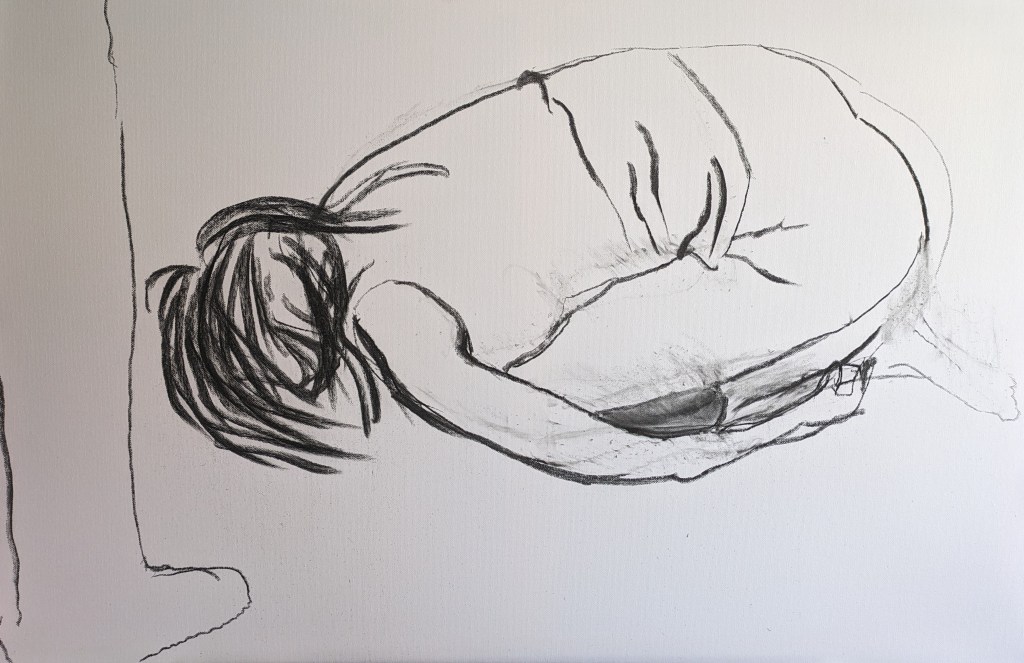
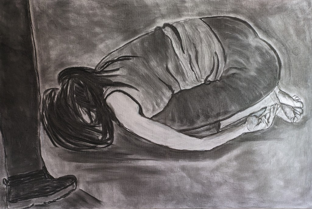
The next drawing is of a child crouching in the fetal position. This drawing is also based on my memories and personal experience when I’ve been in distress. Even as adults we can hold ourselves in this shape for comfort. Its like we seek the comfort and safety of the womb. A lot of children and adults will seek comfort in this position. Rocking in this position is also common in seek of comfort too. As I begin this drawing its again about the power of the adult and vulnerability of the child. I use an internet photo just to copy the shape of the image. As I hit the canvas with the charcoal I get fully immersed in creating the lines and contours of the head and body. I quickly draw in the leg of the adult. The drawing is on a large canvas 36x24ins. I keep working on canvas as I think these images are better unframed.
These more sensitive drawings of vulnerability are again images that are transposing from memories. The pain and suffering and the physiological affects creating such wrenching in the stomach. My hand is guided by my senses and the connections with past events. The charcoal glides across the surface creating the shapes and forms in the body.
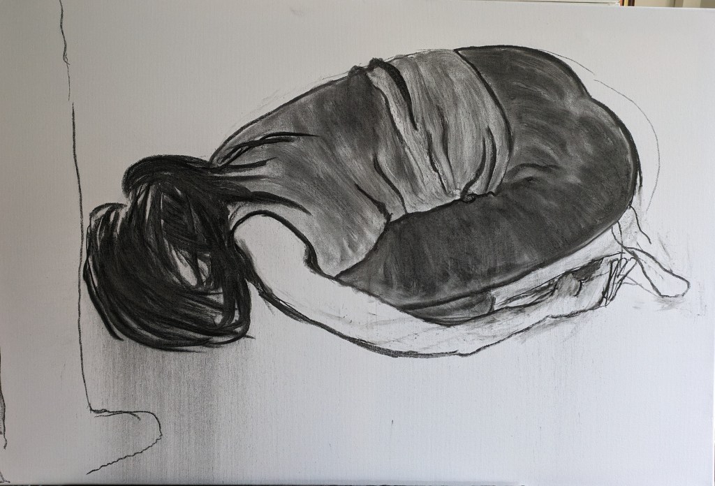
I return to this drawing today. My first decision is about whether I block in the leg. I could leave just the outline to suggest more of what is there and why but I decide to block in the leg as I feel it will add more weight to the subject matter. I also consider more detail now to the hands and feet. The leg blocked in has worked well.
The next drawing shows some improvement to the hands and feet. These were a little tricky but I persevered. I darken the background and refine a few other areas such as shadow along the bottom of the body.
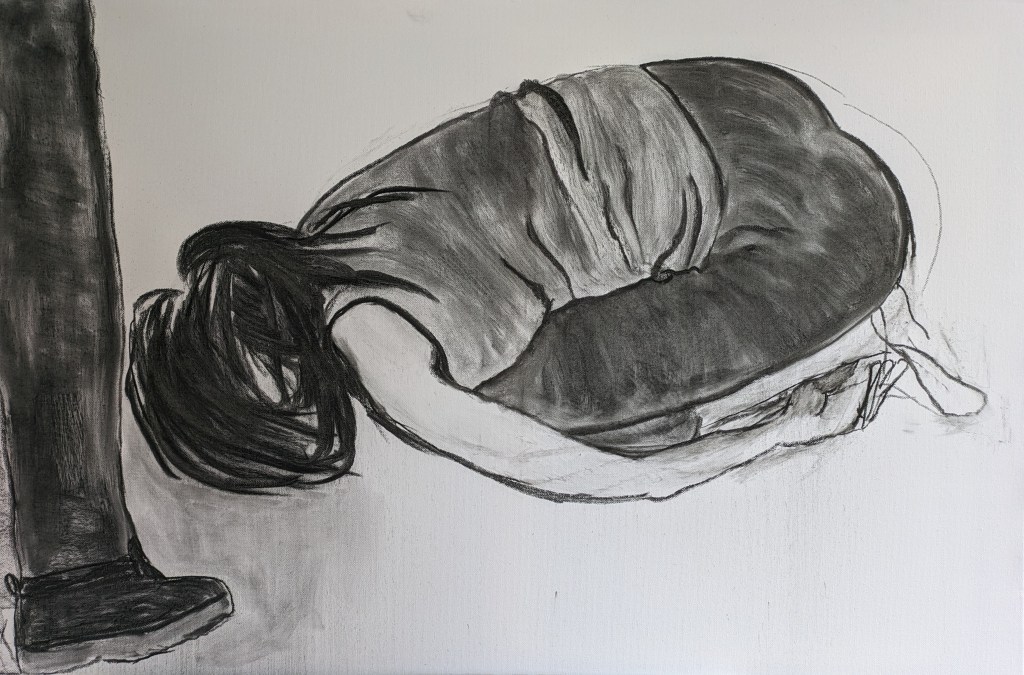
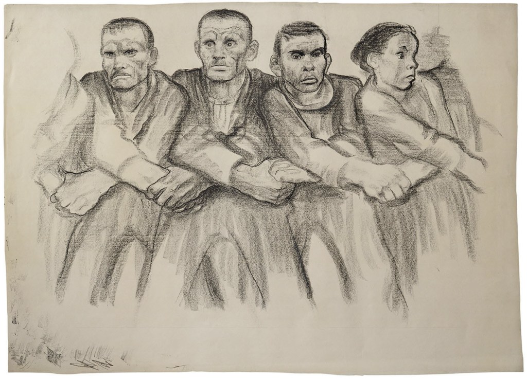
Again this drawing is about the child’s vulnerability and the adult overshadowing and bearing down on the child. As I reflect and survey the image, I do think it is quite a powerful emotionally charged drawing. I’ve been researching further the work of Kathe Kollwitz. She used some of her children in drawings and a lot of her work was about grief and dying. She was German and lived from 8/7/1867 to 22/4/1945. I have included her work in my critical review. The drawings are brilliantly executed and she captures expressions and emotions so well in charcoal and inks. In contrast to Kentridge she is often lighter with the hand on the charcoal or graphite but she achieves such depth of feelings and emotions in the viewer. She was also a sculptor and created lithograph prints etching into a metal surface. I include one or two of her drawings below. The first one is called politics.
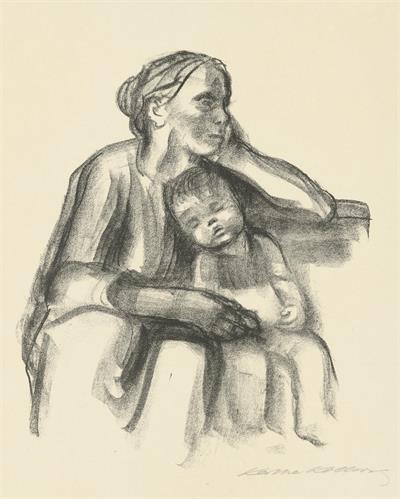
The second drawing is titled woman with sleeping child. All images are from the Kollwitz museum.
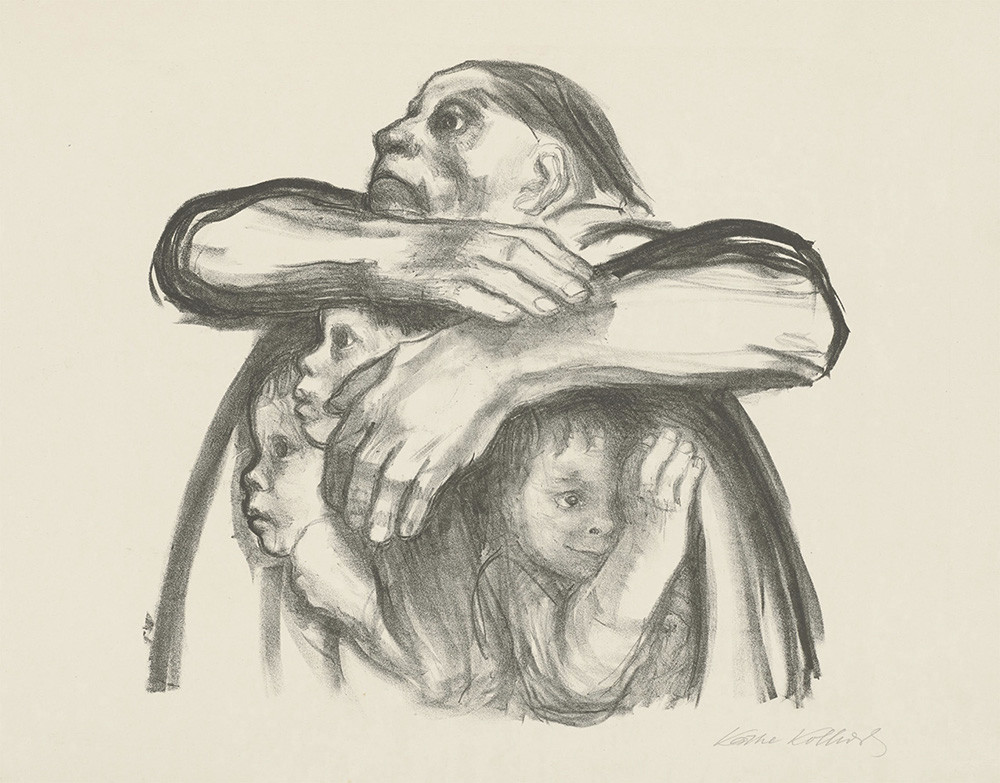
The above drawing by Kollwitz is from the War Years series and titled nachtrag. When I googled the translation there were a couple of meanings but the one that fitted was to hold something against one. The other definition was addendum or supplement. I like to think the first definition fits as the women embraces all the children and enfolds them in safety. I had to include this one as it is about protecting the children and epitomises what I’m trying to do. One child with a worried smile and the other two anxious. The mothers pained expression as she looks on. I already mentioned how I had decided upon the charcoal and to stay with this for the main narrative. My own work is a cross between the work of Kentridge who is more heavy of hand in application with really expressive drawings, and Kollwitz who is more softer and light in application and uses charcoal, crayon. The latter two are with crayon.
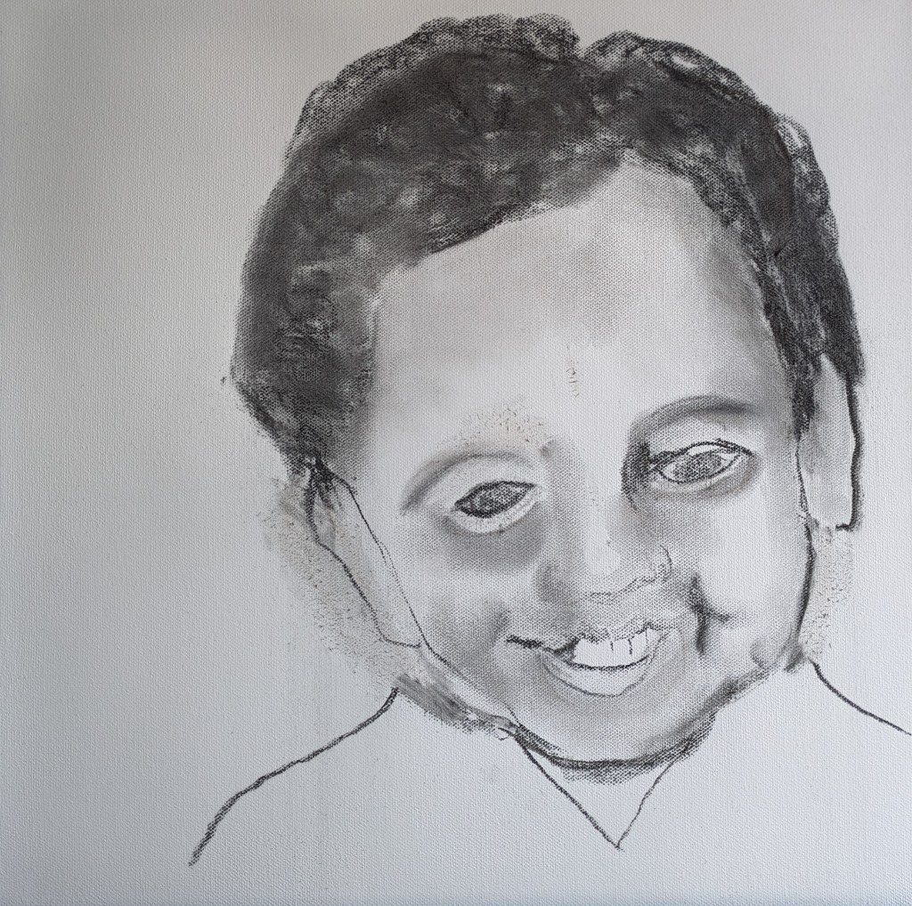
In contrast to Kollwitz work, my images are more contemporary in style. The more I see of her work the more I want to practice drawing that is more defined and detailed. I do now know I can do this as some of my smaller sketches with graphite my self portrait as a child and the small boy were much softer. I also believe that portraiture and figurative work will be more in my portfolio for the future.

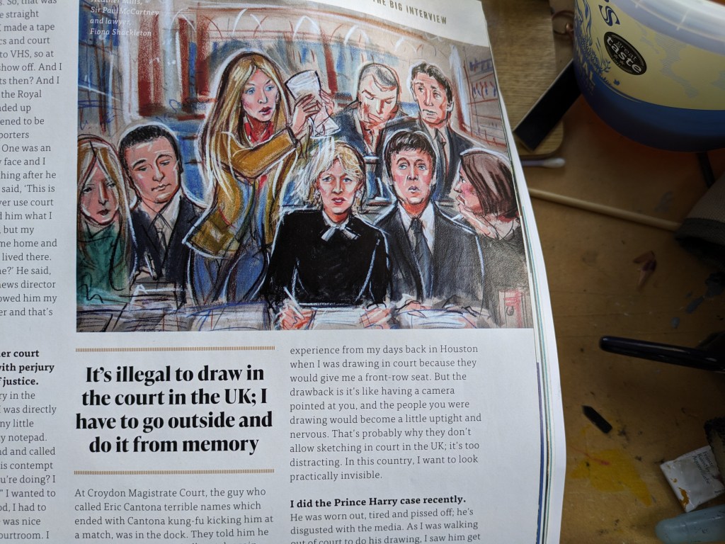
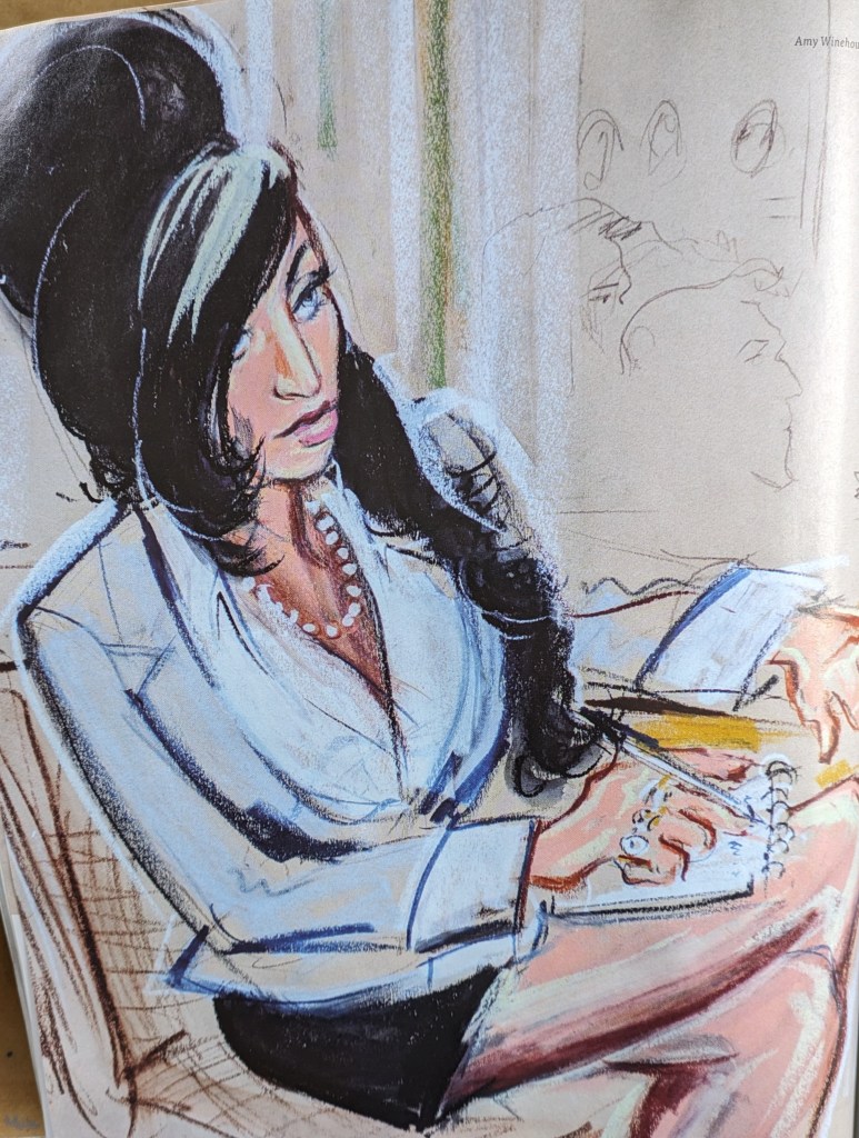
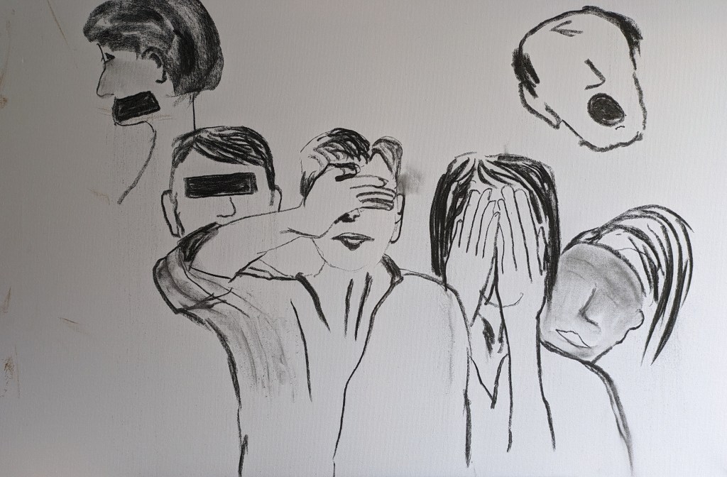
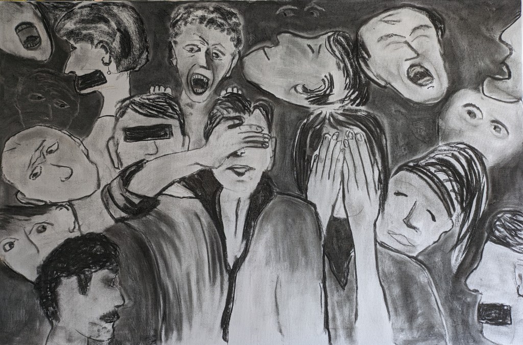
My next image is about the workers involved in the protection of children but its intended to illustrate some of my findings. I might add colour to this drawing. I’ve been studying and reading up on some of the courtroom reporting and the images drawn in the courtroom. I include one or two below by Priscilla Coleman. These are from an article in Artist and Illustrators Magazine. On the left we have Prince Harry. Paul McCartney is depicted in the centre and Amy Winehouse is below. Adding colour to the drawing does alter the temperature as my tutor reminded me, so I need to be clear about my intentions. For this drawing I also considered the work of Annette Messager and I make more reference to this below. As I consider the drawing further should I depict the the workers like headless chickens run ragged, or should my drawing demonstrate energy? or should it still be quite sombre? As I begin and the image image unfolds in my mind and then onto the canvas, the drawing is ultimately about communication. Seeing and not seeing, hearing and not hearing and speaking and not speaking. Its quite a controversial piece and if you look deep into the drawing there are eyes, mouths and ears missing, taped over, hands over the face. Its about won’t, can’t, don’t actions some of which are deliberate. There is a hint at one person trying to clammer to speak out. I hope this is spotted. I’ts probably considered as quite a political drawing in relation to my critical review and findings.
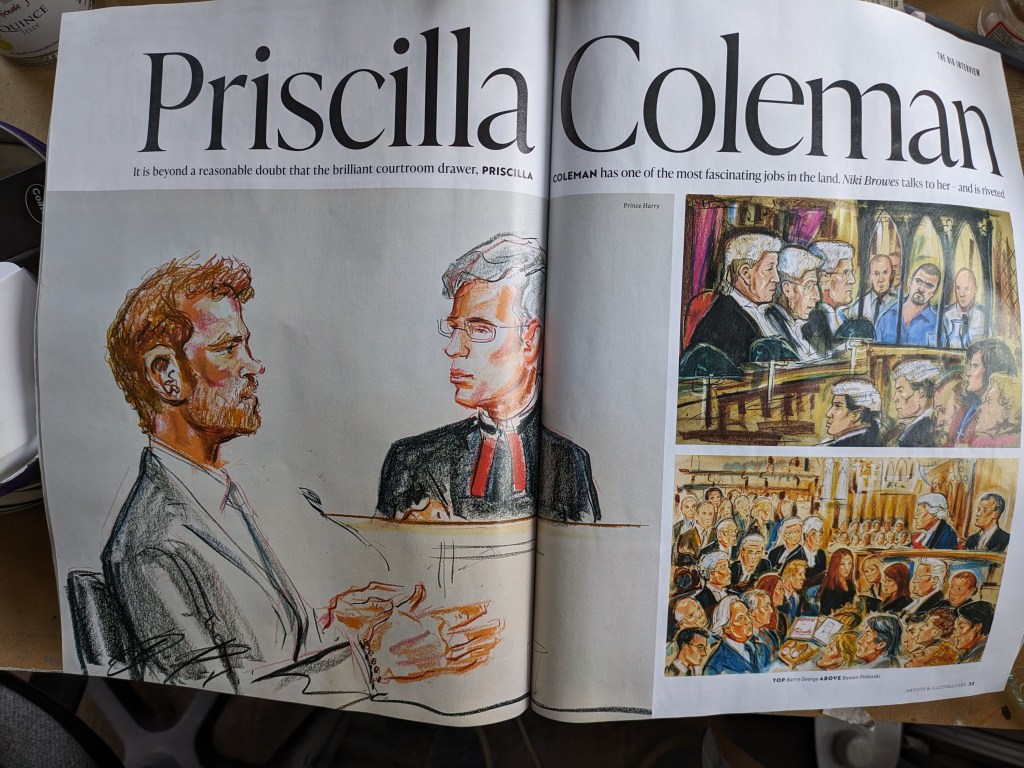
I include the drawing below in regard to the statement made about the legality of drawing in the courtroom. Each drawing is done from memory as you cannot take photos. A lot of my images are also based on memories in particular the more sensitive ones.
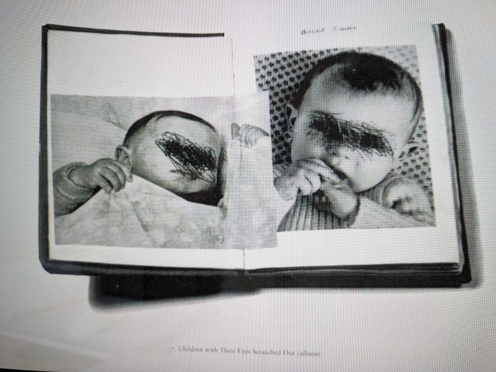
I continue with my drawing. I’m using a large 36x24inch canvas and various charcoal sticks in various sizes. The first outline drawings are the first two figures that will be central and I have obtained one or two internet photos for reference. I use the internet photos to just give me the shapes of the body as the basis of a drawing. The faces are not known to me and again come from my minds eye. This piece as already stated is also inspired by the work of Annette Messager. In a catalogue that I downloaded from the MOMA website that supported her exhibition there in 1995, I found one or two interesting images that were suited to what I was trying to convey. The image below is very emotionally charged as it is of a child with the eyes covered in mesh or blacked out. I hadn’t heard of this artist until a fellow student suggested I look at her work. The image of the children is below. I can’t say I like the nature of this with children but Messager is quite radical in the work she undertakes and is a strong feminist.
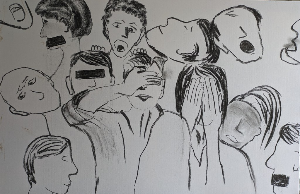
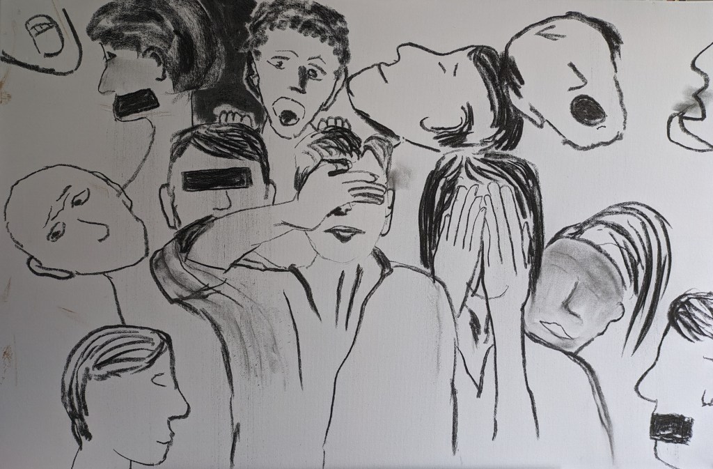
As I look more at this drawing there’s still a lot of work to refine. I want some of the faces to express more emotion. I work some more on trying to achieve this and I add in some teeth to one or two of the people with wide open mouths. I darken the clothes of the two people deliberately covering their faces and eyes. The woman trying to be heard is now looking more angry. I’ve also put in some eyes and faces in the dark areas almost like ghosts looking on. Perhaps the ghosts are the children. I’m not sure about this but need to persevere. I shall come back to this drawing but leave it here for now.
I start to work on another portrait. This was also a child that died where there was a transformation in services. I shall not go into details of the death as since the discussion with the ethics committee I do want to be more sensitive to my tutor and her feelings if she reads difficult material and explicit events. I shall refer to the child by initials JB. She is another child who seems to have been forgotten. I begin to draw the outline and block in the hair and shadow. The quality of the photo found on find my grave is not very good or clear but she is smiling. My first image of the drawing is below. I shall stick to the charcoal. JB is of African Caribbean origin. I leave there for today.
I pick up on completing the above portrait. I work more in all areas and begin to also darken the background as the image below shows. In the photo there is some dark shadow in the right so I begin to put this in. The features all need some refinement the eyes, nose and mouth. I draw in more defined but broken line around the body. I texture the background with the use of using the flat of the charcoal stick. The main issue as I work in just the charcoal is to balance out the dark and light tones in both subject and background.
The next image shows more darker contrast in the drawing. I still need to work on the features but it is improving.
I work more on the features and softening these up a little. I also darken the background a little.
The final image is below.
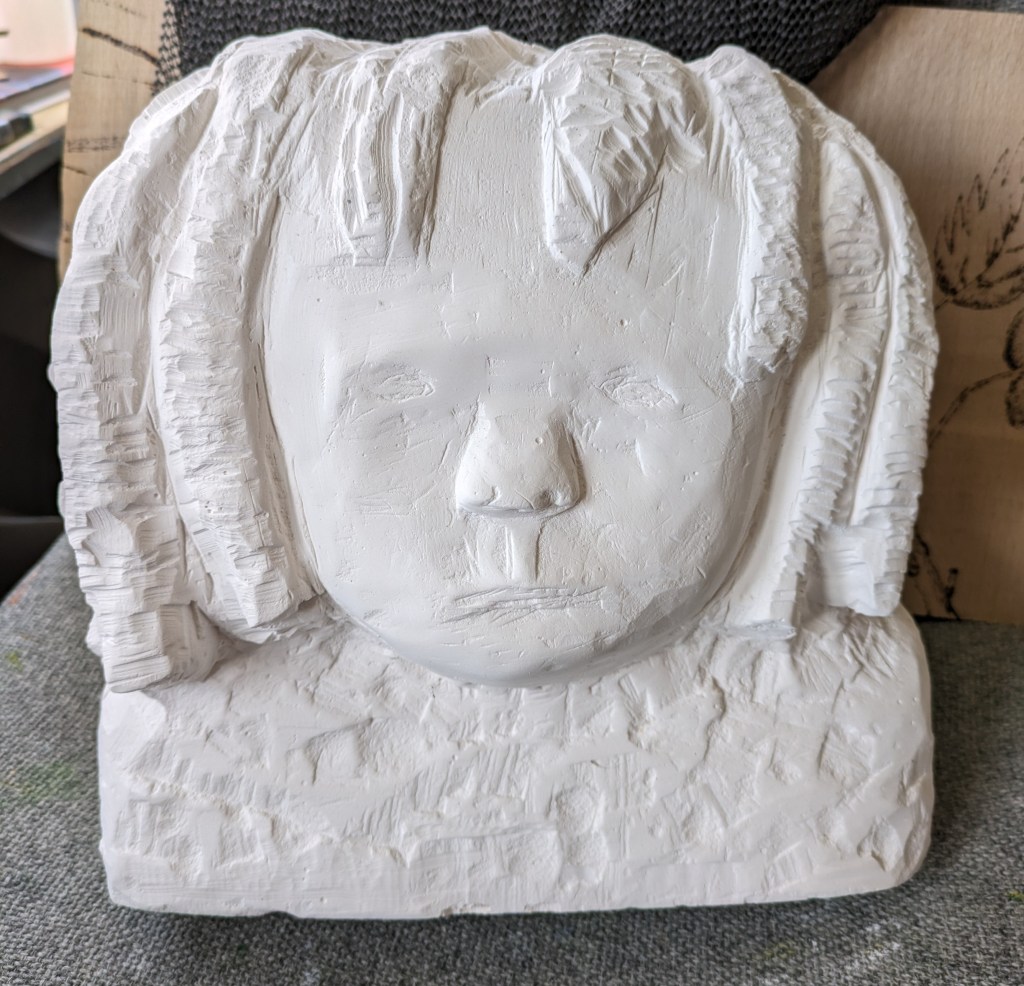
Today I dig out of my garage a sculpture I had not really finished from when I undertook my Access course. I want to see if I can finish this and include it in my exhibition. I also intend to complete a relief sculpture. These are intended to represent the innocence and beauty of the child. The sculpture was initially based on a friend’s child who had a lot of curly ringlets. I am altering however to maybe represent an African Caribbean child as so far I have drawn three and have also got another one in mind. The relief sculpture will be of mother and child in a gaze, a bit like the Madonna and Child but more contemporary. The image of the sculpture is below before I begin to work on it further. I used plaster of Paris and made a block by pouring it into a wooden frame. From my recollection I sealed the frames edges with clay. I remember leaving it for a good week before I removed the wooden surround. I was then ready to carve into it.
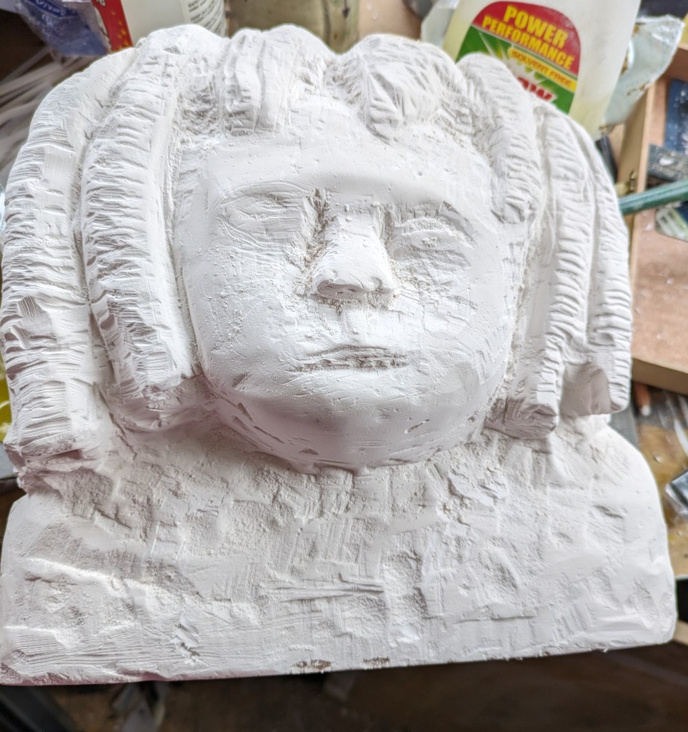
I work at this a little bit today. I remember using a Dremel tool to create the ringlets. I charge this up ready but don’t use it today. I do a little bit of carving into the plaster but I fear my tools are not the best. I let a friend borrow mine so I may need to see what I can find or get new ones. The image below is after a little carving into the face. I need to create more form in the facial features and to shape the head or forehead more under the hair. I work on this a little today. It’s looking a little better already but I must be careful not to spoil it. You cannot rectify the sculpture if you hack away too much.
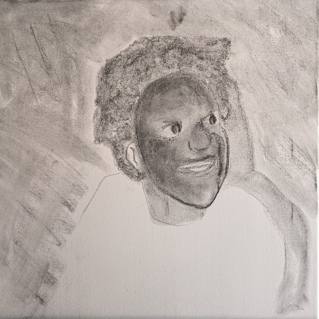
I begin another portrait today. This child is also of African Caribbean origin. I begin to draw the shape of the head and the features. In the photo she is wearing a tiara to represent a princess. I am not including this in my drawing. She has a lovely cheeky smile and I hope to capture this.
The next image shows more of the shape of the hair and a lot of work on defining the features. The eyes are still an issue and need a little work but I have managed to capture where the light falls on the face. The mouth also needs a little adjustment too.

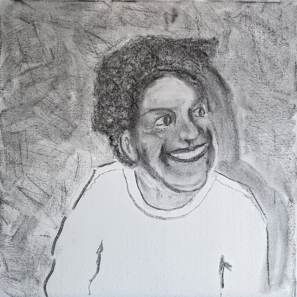
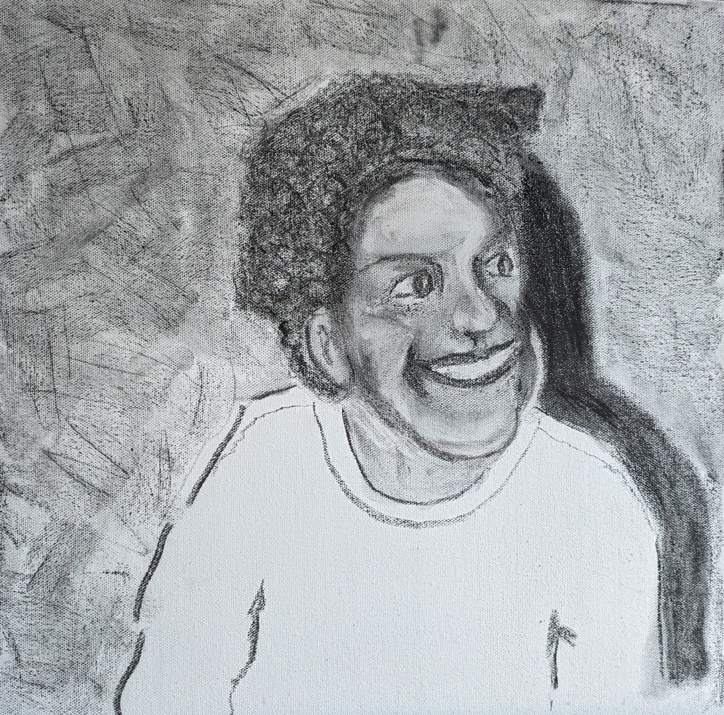
I work more on definition, the right ear and background. I create shadow but this may be a little dark. I like the features and there’s now more of a likeness.
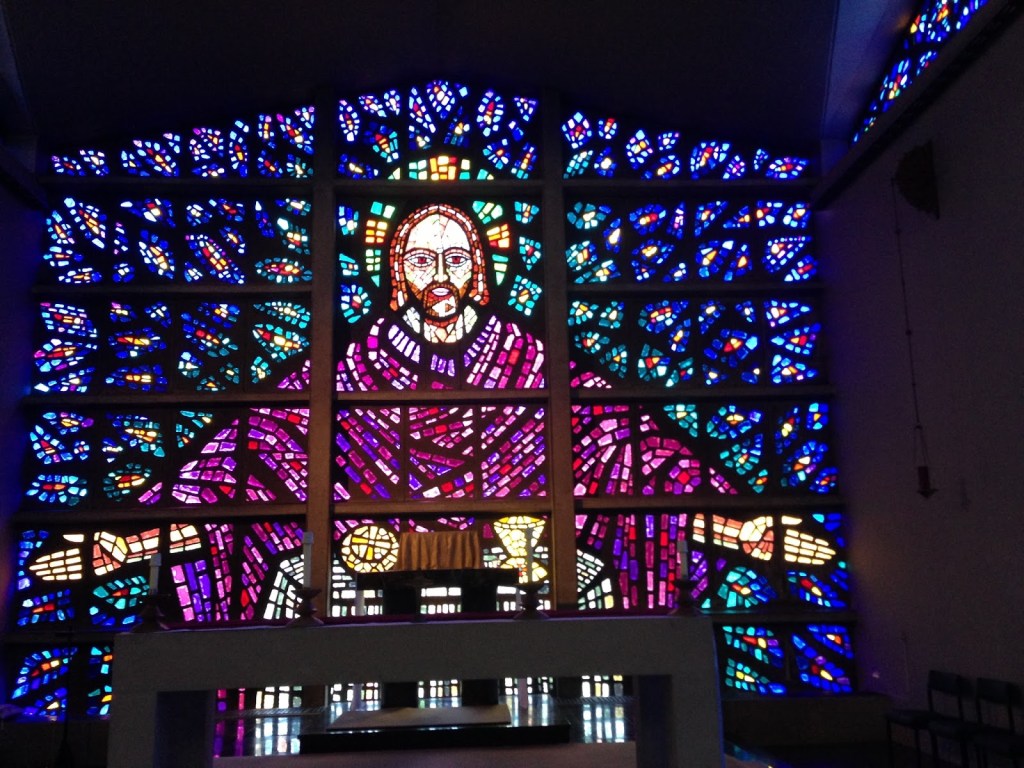
Today I start on the final piece in the exhibition. It’s how to represent all the children, over 1000 that have died. It took me a lot of deliberating about how to do this. I considered 1000 small candles, a large painting of wild flowers but settled on something that I guess might have been done before….I don’t know. I am inspired by a large stained glass window that is situated in Buckfast leigh Abbey. I took photos of this a while back. The window is so beautiful and it is huge. I include an image of it below.
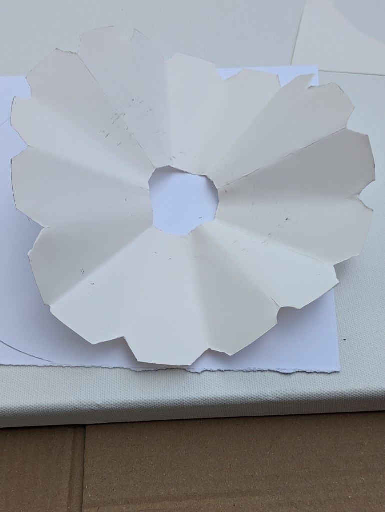
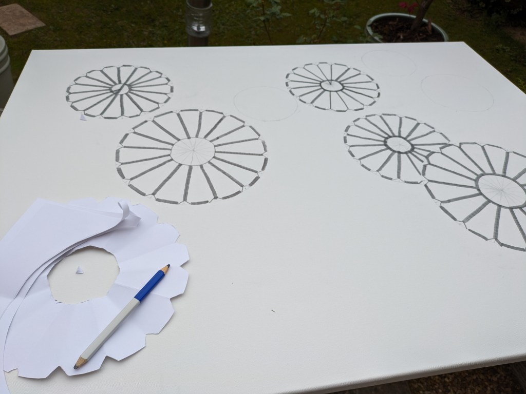
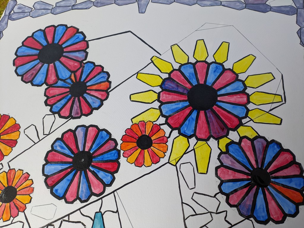
I want my image to look like a stained glass window. I decided that I would create flowers but in the shape of coffins. However they would only be recognised as coffins if you know about the subject and the message behind the work. In order to start I made a small template to test out how the idea would work. I folded a circle of paper and snipped the bottom of it after I had folded it into 16 pieces. After snipping the bottom I then snipped the corners and I had 16 petals in the shape of a coffin. An image of the small template is below.
I’m working on a very large canvas for this piece. What I hope to achieve with my design is like a large stained glass window. There will be large and small coffins and some overlaps in shape. I hope to make it very bright and to achieve the effect I want I need to use oil paint. I shall add into the paint zest it and liquin gel. The liquin will help provide a high gloss sheen that I hope to resemble the panes in a window. I shall also use brush-strokes/marks in the paint that might also resemble jewel like qualities/three dimensional. I initially draw out my image from the template and initially use a black marker pen. I go over this with black gesso or acrylic black paint. The image below shows how I use the template and then add the black line from initial pencil outlines.
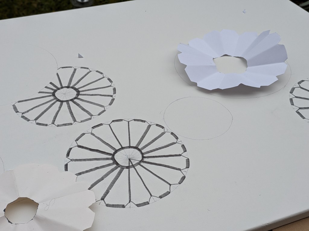
For the circular outlines I use a lid from a potato bin and a large frying pan lid. The next drawing shows the coffin shaped petals. I don’t want the drawing to be too uniform so I deliberately use overlaps.
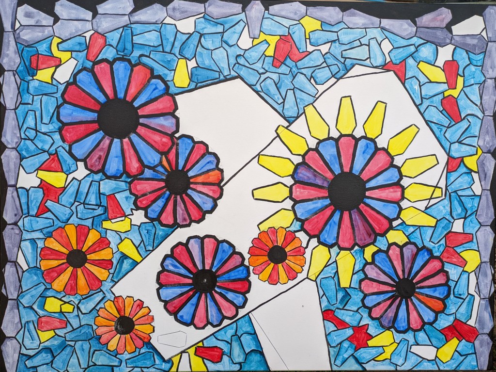
I begin with mixing up two colours – ultramarine and alizarin crimson. The photo below shows my first layers of each colour and the middle colour is a mix of both. Stained glass always has different shades and tones and the glass usually has some imperfections. I’m not looking for perfection but I will try to represent each segment/coffin with great care. As I begin to paint I have to do these children justice and the strong feelings invoked as I paint each segment is similar to the feelings I have when painting the portraits.

Below shows the first completed flower. I will continue with a first layer and then build the layers if necessary to create the glass jewel like effect.
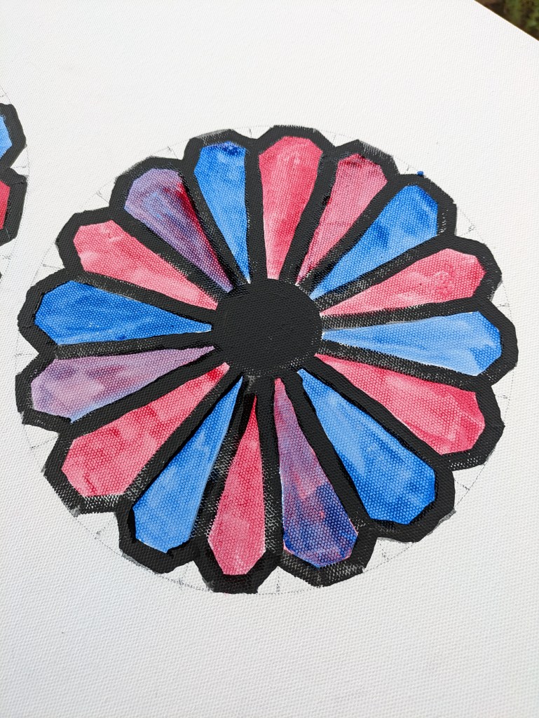
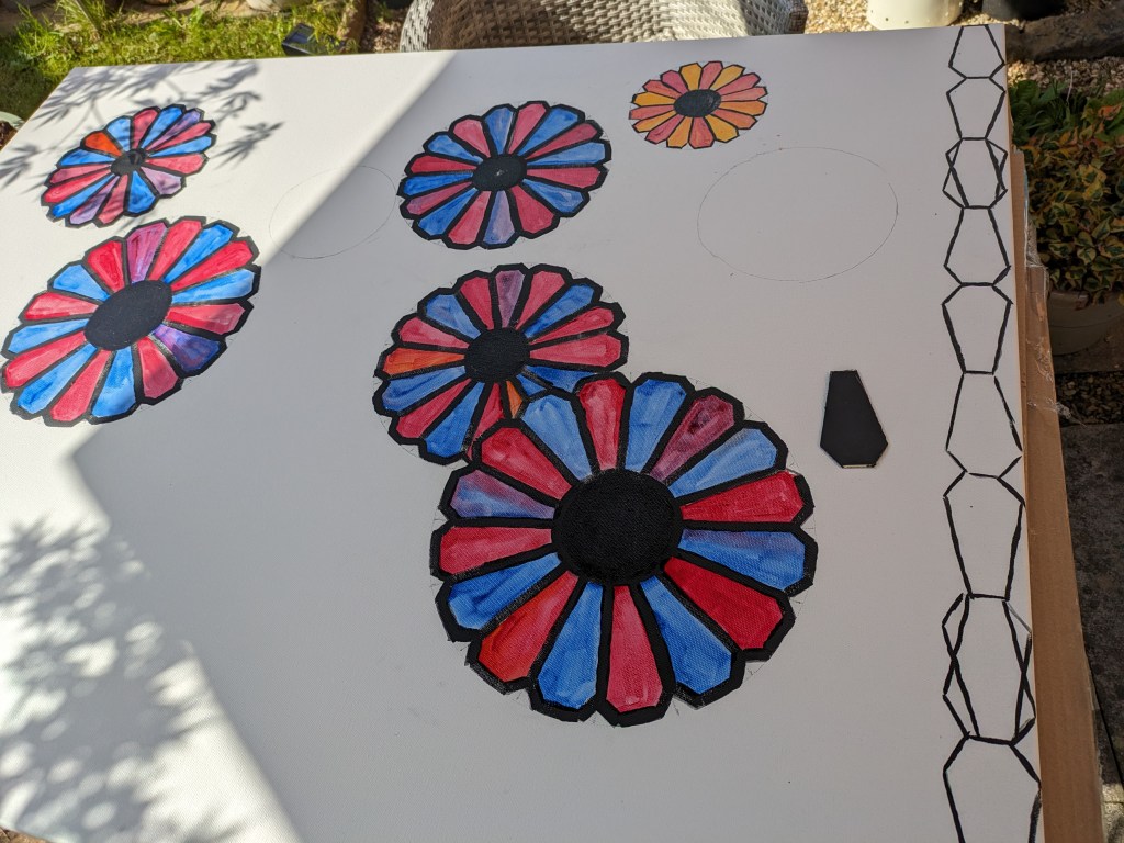
The image below shows the inclusion of another colour = cadmium yellow. I mix this a little with alizarin crimson to create a more orange colour.

The image below shows several of the large flowers and one of the smaller orange coloured. On the right you can see my black template for the outside of the window and the same coffin shape. The larger flowers have been given two coats in some areas and I’ve used the brush to help give the glass some form. Due to its size I am managing this canvas on a table in the garden. Today the weather has been good so I am hopeful to undertake more work in the next few days. I’ve worked quite well at this today but it is going to take some time. I must be careful not to rush it.
The image above shows how I’m building up my petals and how I use the coffin shape as the frame to the window. Below is my drawing/painting for today. I draw in a large coffin shape but the top edges are not shaped at the right angle. I will adjust but might also make use of the extra lines. I leave it there for today. The outer edge will be black like a leaded window.
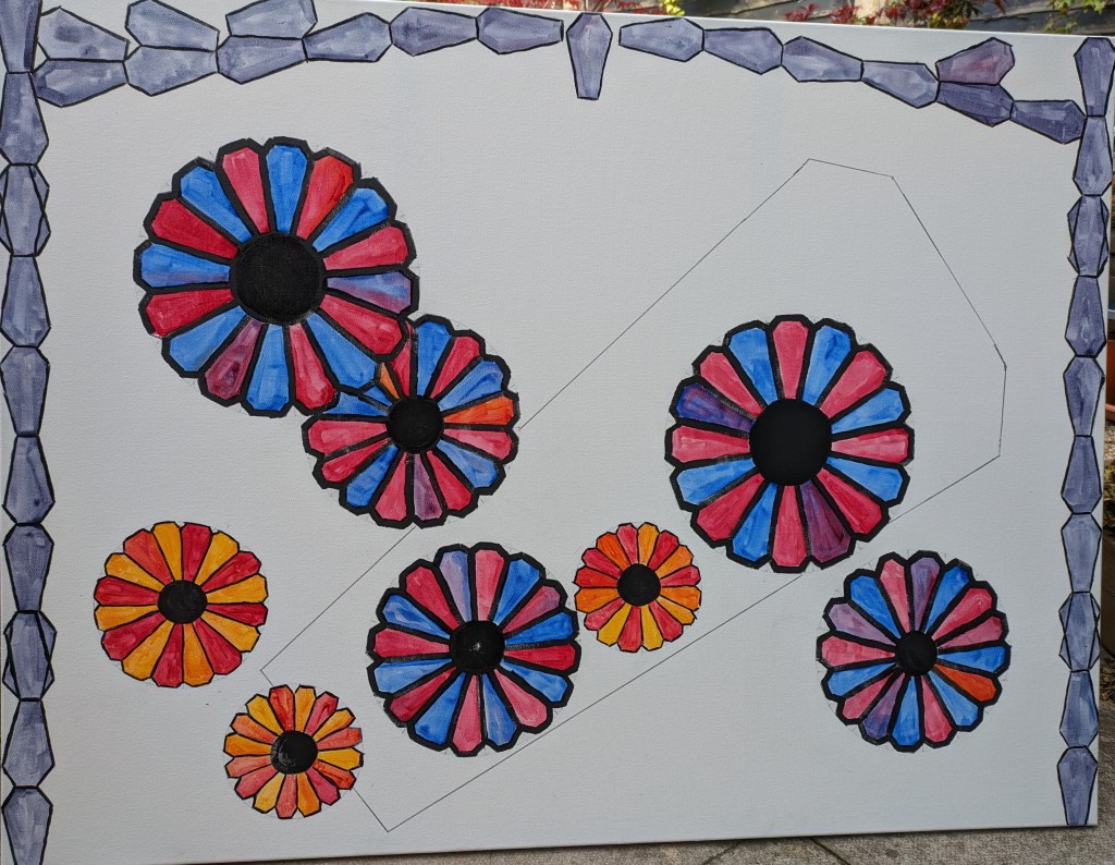
Another good day today so I’m making good use of painting outdoors. I concentrate on trying to use a slightly smaller template for the coffins and cut this out from a plastic plant label. I start to complete ten at a time scattering them both randomly and some strategically close or joined. I also add in extra coffins of the larger template around one of the large flowers. The image is below. I complete this in yellow to symbolise rays of sunshine that should have helped the children blossom. With each stroke of the brush that draws the coffins again I feel close to these children and I must represent them well in this painting. I really like how its shaping up and the boldness of the yellow works well.
I work further and my palette is similar to that of the Abbey window. I keep counting the numbers and my palette is a turquoise, red and yellow. I also leave one or two white shapes. I guess the palette also reminds me of Mondrian. I work more at the black edges to see how this looks and I work in more mosaic around the two images that are quite bold as coffins. The final image for today is below. I like how its beginning to look but I need to represent over 1000. My title might be 1000 and still counting. I would like to see how it looks with a light behind it but I’m not sure if this would work. I must not be too ambitious. Some areas may need glazing a little more.

I keep working at this and trying to keep count of the coffins. I’m beginning to like the colourful and playfulness of the work. The next image shows how I get to the larger coffin shapes left.
I like how its shaping up but it would be good to have a critique on this one. I start to work more into the coffin shapes and I decide to keep the background the same colour. My intention is that the coffin shapes are not that well defined. I show my artist friend David the image below when I am almost complete and he said he wouldn’t have known they were coffins until he was told.
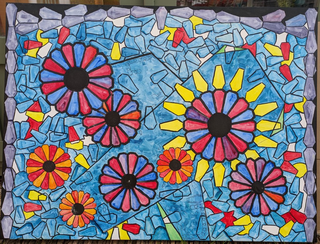
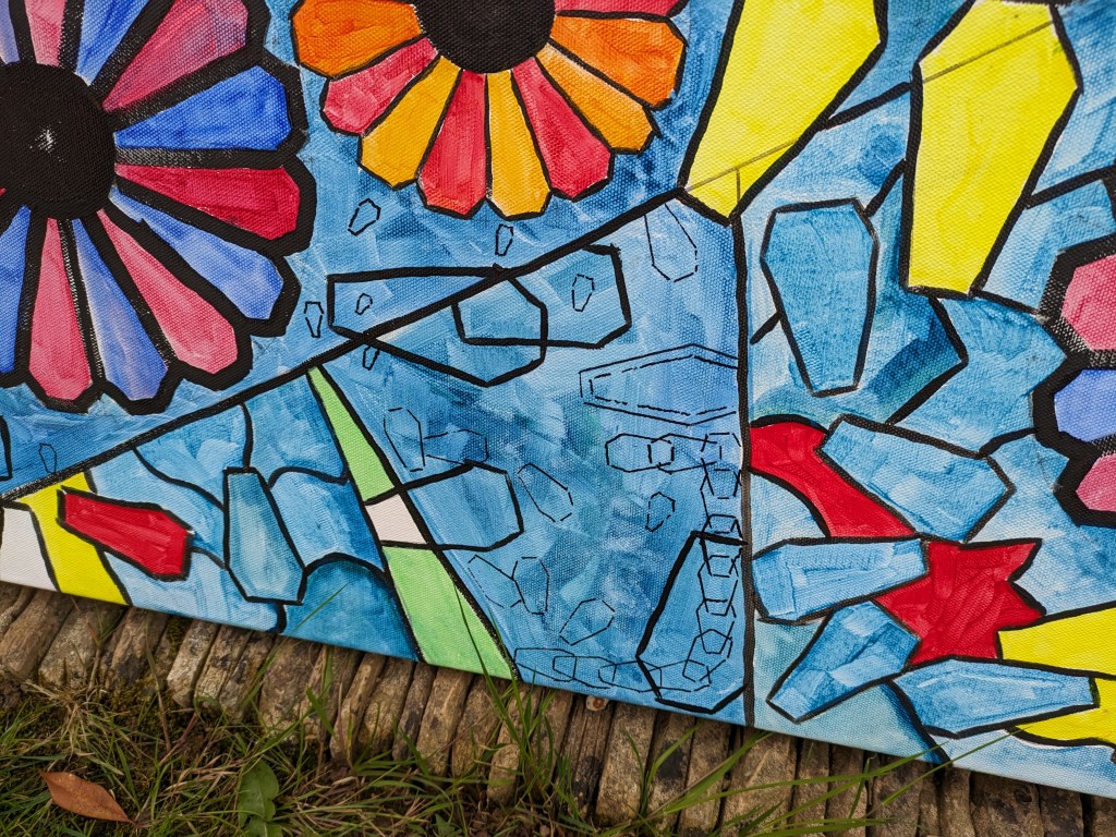
In this image I have deliberately not cropped it fully as it is easy to chop off the edges. You can see how I am building up very small coffins in a playful manner some overlapping. Below is a close up of the smaller ones, again not cropped. I’ve linked some together as a symbol of unity. I’ve also accented the larger coffins with green.
Today I start to work on the other images in my mind. This was inspired from the reading of the inquiries. It is of an ambulance scene and female paramedic consoling her male partner after he is distressed by the death of a child he has encountered. I begin to draw the shape of the ambulance from an internet image. I also try to draw in the paramedics. It is important to acknowledge the impact and effects upon a range of personnel. I draw fairly quickly copying an internet image for reference. I also google an internet image of paramedics so that I can draw the uniform. My drawing begins to emerge. I’m undertaking this one on another 36x24inch canvas.
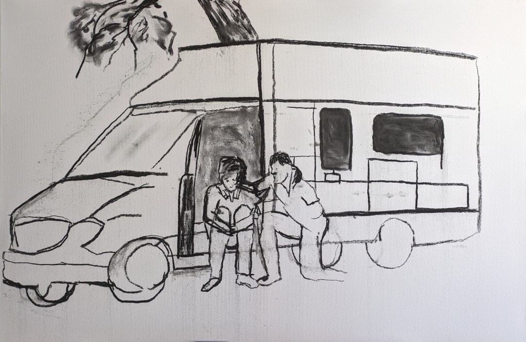
When I get into drawing with this medium of charcoal I just get lost in the process and I can’t believe how the drawing comes to life. I now consider my drawings to be a cross between Kentridge and Kollwitz. Kentridge is bold and he uses heavy line/marks and Kollwitz uses a range of styles and skills. I consider her work to be a little softer when she uses the charcoal and some of the work is simplistic. My next image shows more blocking in of the van and correcting one or two of the lines for more accuracy. The door is open so I must get this right.


I then start to test out the shading. Where to go light and dark and I must get the chequered pattern on the van. The drawing above shows this and it works okay to go darker on the pattern.
The image below shows how there is more colour blocked in. I go lightly applying the charcoal with the side of the large stick and then rub in with fingers. I apply more heavily in the darker squares and this works well. I also refine some lines with the eraser. This rubbing in and out is still serving me well.
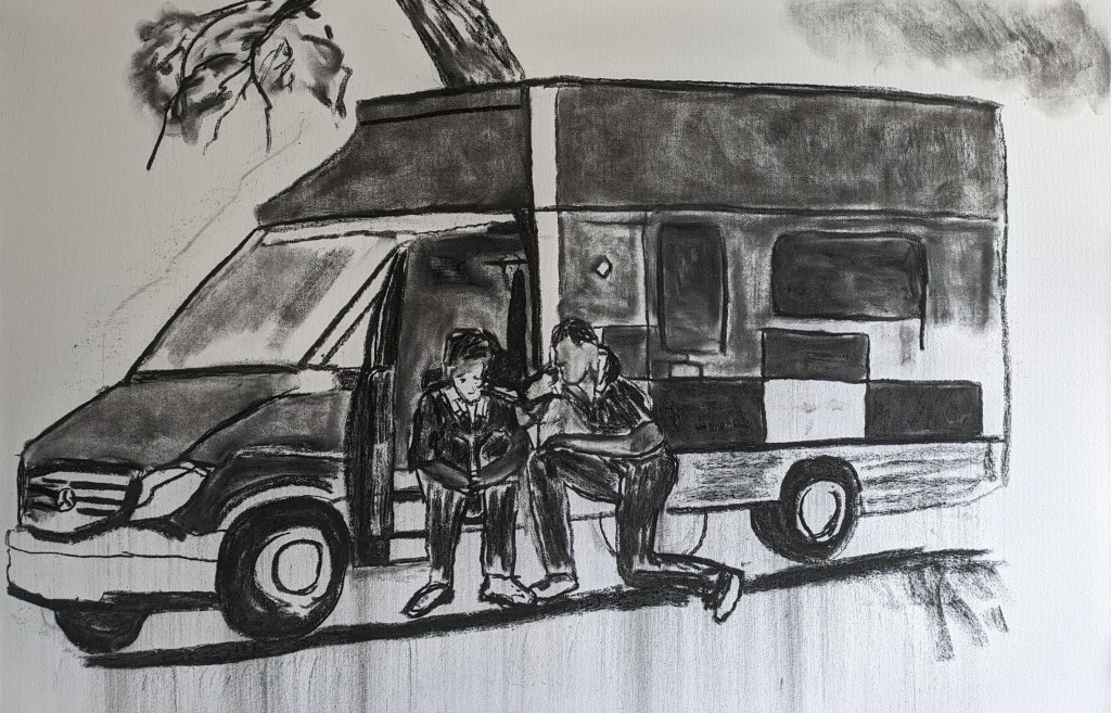
The image below shows the drawing almost complete. I darken some of the background, the tyres and add the shadow under the vehicle. The main thing left is to refine the figures and faces. I also need to write in ambulance and demark where the lights are and neaten some of the shapes on the van. I’m so enjoying this drawing and today I’ve been commissioned to undertake another pet portrait!
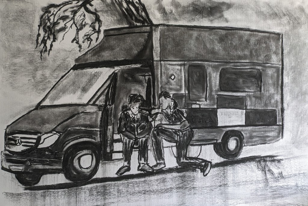
I complete this drawing today. I refine the faces, define the wheels, add writing and darken the edges of the scene a little. The final drawing is below.

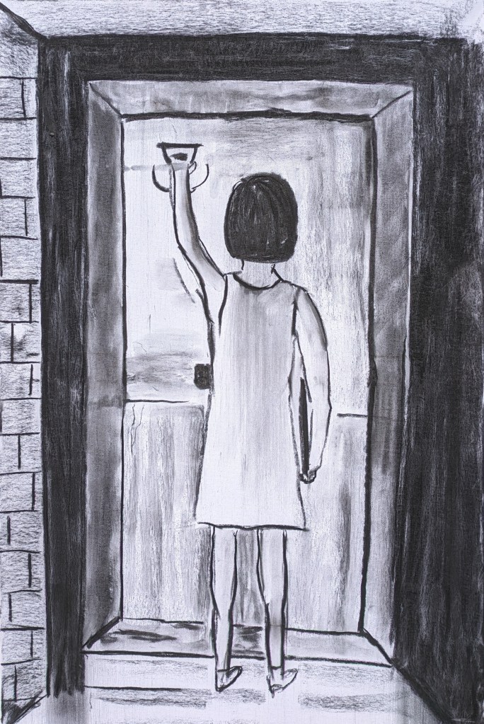
My next drawing is about the unanswered door and workers not able to see the children. Broken appointments and avoidance. My first image shows the first marks and outlines.
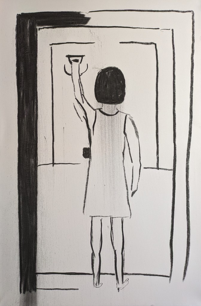
I work into the drawing further and make the recess. I’ve used a little broken line on the young woman. I give her a file to hold as she knocks on the door. As I’ve read more inquiries the more images come to mind. One report had twenty seven visits planned but only fourteen appointments were kept.
As all the work comes together I believe there is a good strong narrative and the work can be curated in a reasonable sequence.
