As I start part 3 I’ve reflected a lot on the project and I feel confident in making one or two changes. I’ve referred to why I’m making changes a little to the portraits in part 3 exercises. While I want to complete the portraits of the children in charcoal as I am beginning to really embrace this medium, It’s about celebrating their short lives so I am adding colour in the backgrounds. To test this out I am using one of the existing portraits I’ve completed. All of the portraits of the children will be on a 40x40cm (16x16inches) canvas. Visually they will be viewed as a block. 6 across and 6 down means I have 36 canvases. This way they stand strong together. I shall try to put them in date order in regard to their deaths. Due to the vast number I shall devise a large canvas that hold the names dates of birth and deaths, like a huge memorial plaque for all of them including the 36. These are my thoughts at present but things may change.
https://www.theguardian.com/uk/2012/mar/01/witchcraft-ritual-abuse-hidden-crime
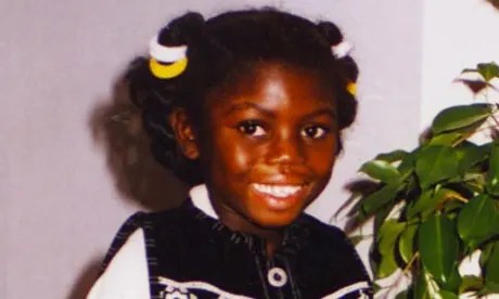
The image below is from the guardian newspaper.
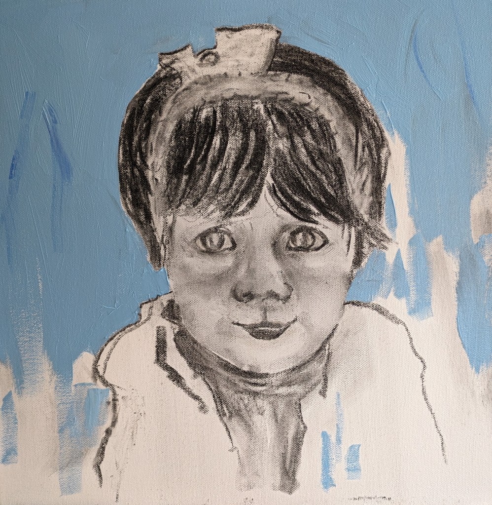
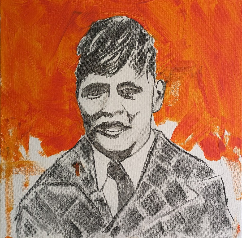
I am going to use two main colours a bright orange to depict sunny brighter days and blue to also reflect bright blue skies. This kind of background has worked well for Hockney and for Claudette Johnson as already explained. I begin by using up some old paint. I often save oil paint in small jam jar pots and I had some orange. It has seen better days so I mix in some zest-it and some safflower oil. I then consider its application on top of the loose charcoal. I decide to wipe some off but then also consider that it didn’t matter if some of the charcoal was washed in. The next drawing is with some of the paint.
I keep working at it and I think it could look okay. The next image shows how the colour is building up.

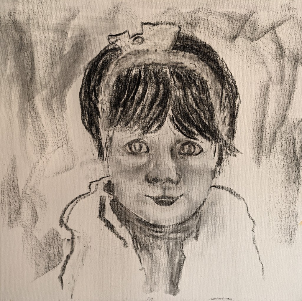
I quite like this as it is. It’s characterful and playful. The next image shows the finishes paint blocked in. I deliberately don’t go right down to the edge or bottom of the canvas. These images are about unfinished business, unfinished lives cut short and this as part of my process is symbolic. As I progressed I caught a bit of red paint in the left hand corner of the canvas. This wasn’t intentional but I couldn’t help assimilate this to how Kentridge marked in red on peoples faces where their injuries were. I decided to leave the smear of red.
The final painting is below.

The light is fading and my camera has just about picked up the true orange colour. I must give the painting another coat of orange in parts as there may be too much charcoal. I need to adjust the facial features as I notice quite a bit more work in several areas, eyes, nose shape with light and dark and also some adjustment to facial shape.
I adjust the nose as below. Its much better. I also adjust the hair a little.

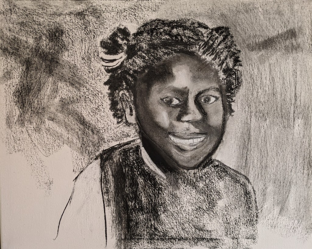
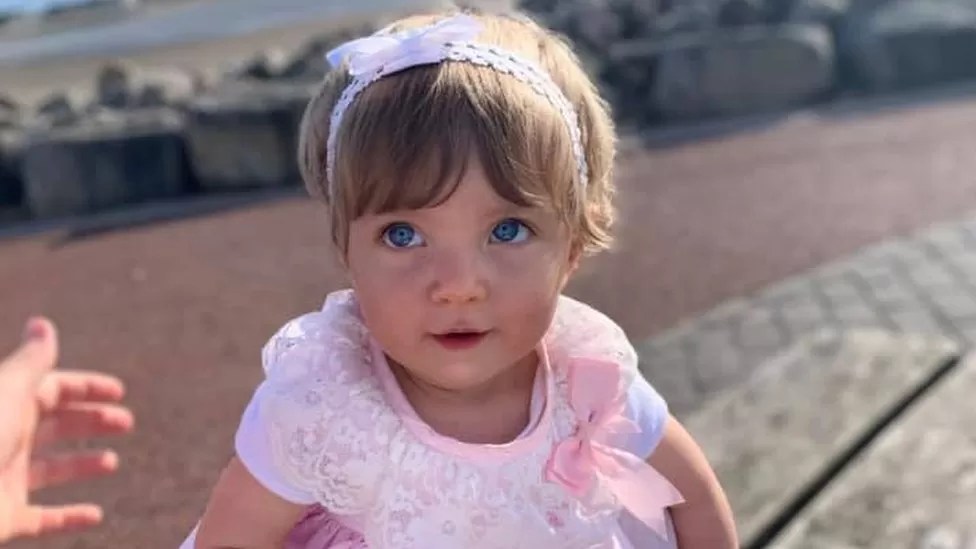
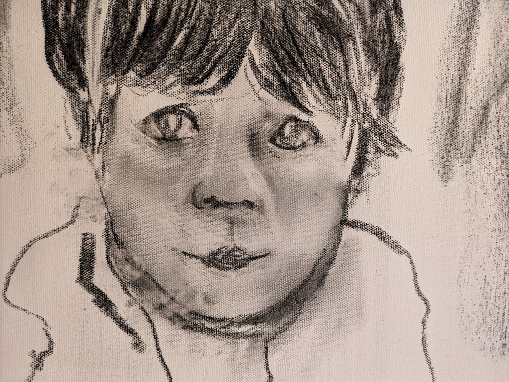
I move onto my next drawing this child was killed by a a huge internal haemorrhage caused by a huge blow to her stomach. As I look at the photo I’m staggered by how anyone could do such a thing to this beautiful child. They are all beautiful. I obtained the image from an internet search and she relates to one of the inquiry reports.
https://www.bbc.co.uk/news/uk-england-leeds-59599884 The image is taken from the above web link.
Again I feel such an affinity with this child as I start the drawings. I begin to start just making some facial feature shapes and blocking in. The initial drawing looks more like an adult so I need to hone in on the more subtle features.
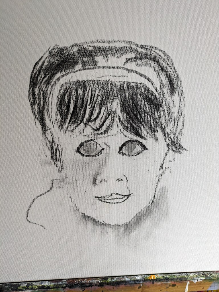
I try to work on the eyes and the facial features but its trial and error. What I really notice though is how the charcoal is so malleable and the erasure so easy. This child has such beautiful eyes. I must try to get this right and she is only 16 months old. I keep persevering with the lights and darks and the features being in the right place. I adjust the eyes as I notice quite a gap between each eye and she has a lovely flat buttoned nose. I realise further that the mouth makes her look older so I adjust this too.

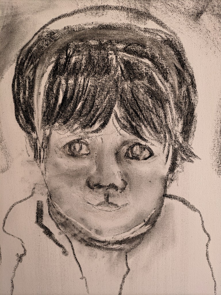
She’s looking a little better but the hairline isn’t right and I check more dimensions. I’ve added a little charcoal to the background but not much. These next two images do capture a sombre sadness but that isn’t what I’m looking to create.
I reflect a little more and as the light is fading I leave the portrait there for today. There’s still a fair bit to do and adjust but I’m a bit happier with where all the facial shapes and the overall hair lines should be.
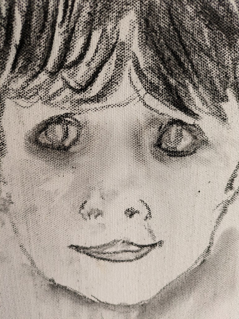
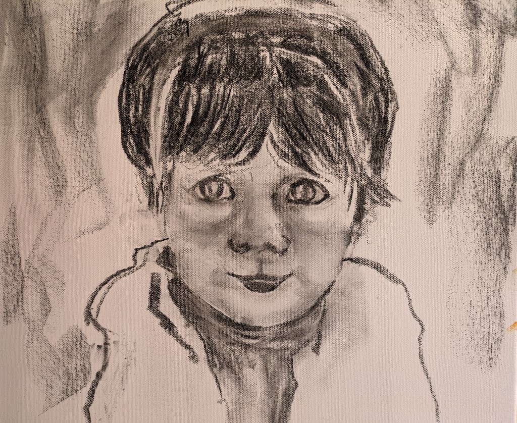
Another day and more work to do. I keep working on all the facial features and the shape of her face. It’s always down to observing well and the more you look the more you see. I’m often just standing back and checking the facial shapes and if they are where they should be. You measure one shape against another and are constantly checking your drawing with the photo. The next couple of images show one or two adjustments. I need to adjust the eyes and mouth and the facial shape.
The image below shows where I’ve moved the mouth, have adjusted the eyes and I’m beginning to change the facial shape with an erasure line. There’s a little wry smile on her face so I hope to achieve this. She looks more sad and worried in the one above.
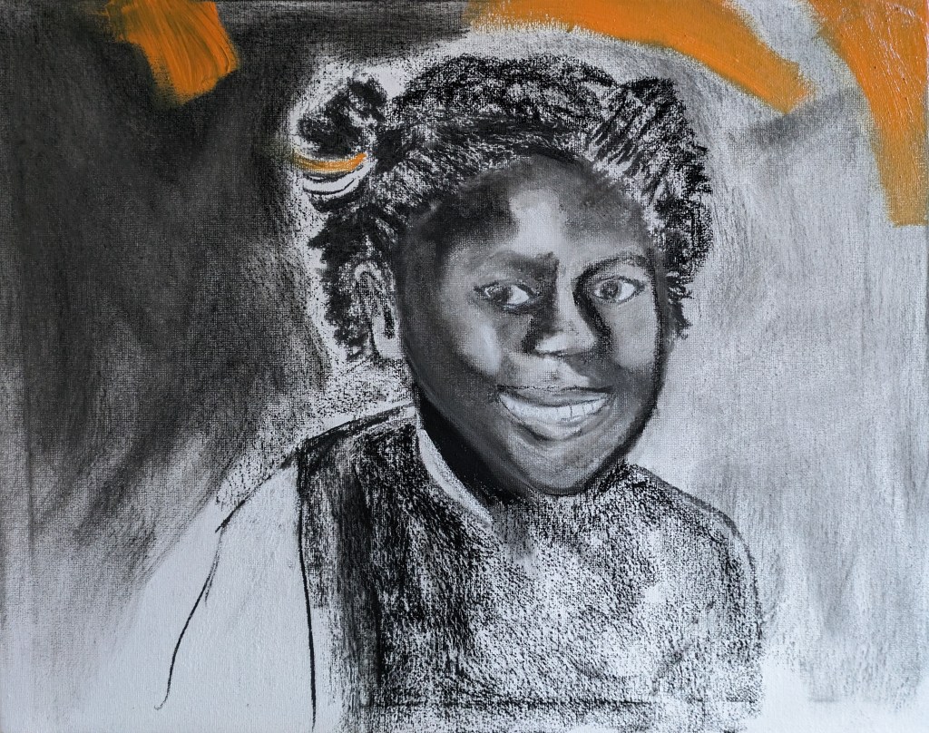
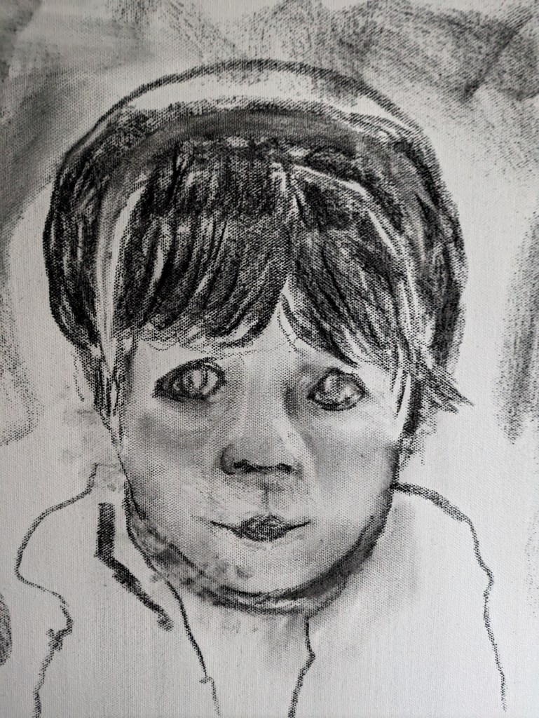
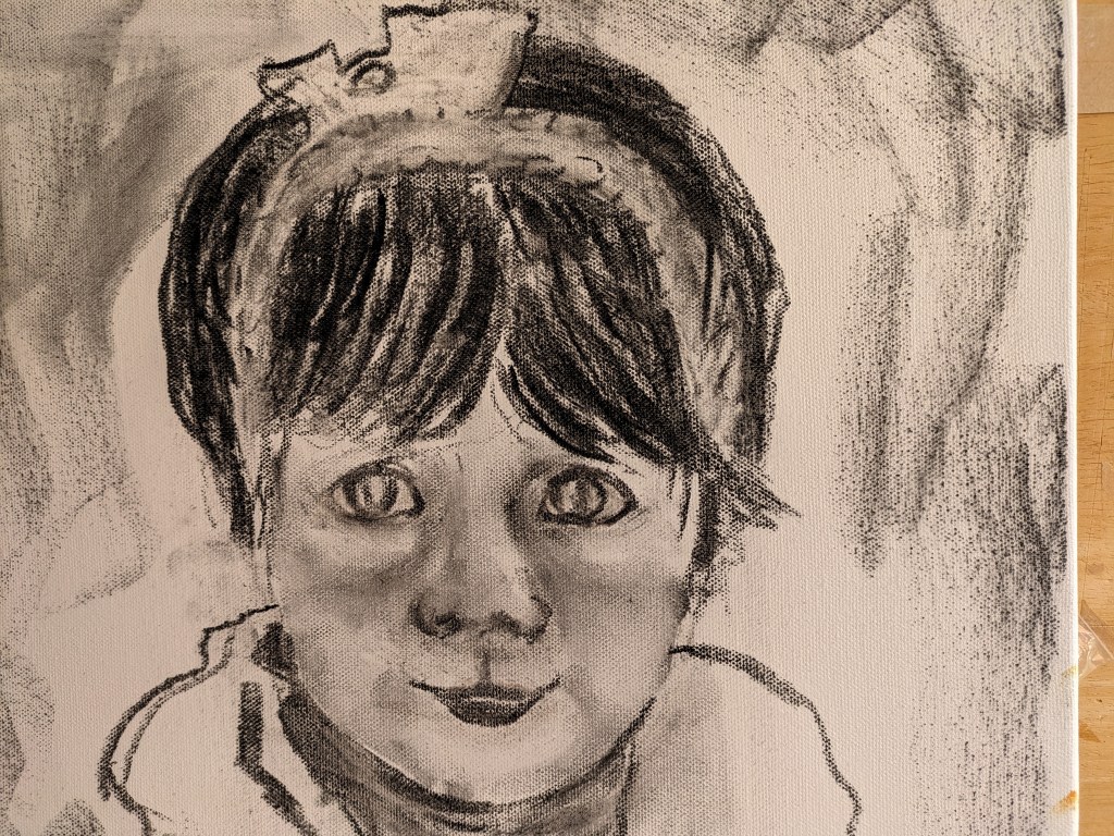
I work more on the eyes and I’m almost there and to apply some colour. There does seem to be a little smile. I also need to work on the hair band.
Another day and I return to this portrait mainly to undertake the hairband and block in some colour. I also decide to not put any charcoal in the background so I try to wipe off the charcoal that surrounds her face and body.
I work on the hairband first and erase and redraw. I don’t have the full view of the top of her head so I do the best I can. The image before the paint is applied is below.
I wipe the darker unwanted charcoal away before I add the paint. I also darken the hair in places and add one or two strands of hair that are coming forward over the hairband. The final image is below.
The blue is okay but I want it to be brighter and deeper. I shall adjust this. Again I don’t finish the painting as it reflects their unfinished lives and unfinished business. I notice I also need to adjust some definition in the bow of the hairband. I also need to clean it up a little.
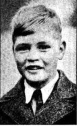
I begin my next drawing and its the very first child where there was an inquiry back in 1946. This boy is Dennis O’Neill and he was murdered by his foster carer back in 1946. He was born on 2/3/32 and died on 9/1/45 at the age of twelve. He was beaten and starved. On examination he had suffered heavy blows to his chest and died of cardiac arrest. His review transformed how foster parents as they were called then, were vetted. I found the image of him on the following website
https://www.findagrave.com/memorial/57521569/Dennis-O’Neill
There were no details of the photographer or its origin but I believe it might have been taken at school.
As I begin to draw Dennis I can’t help but think how many deaths there have been since and there have been others killed by their foster carers. While the photo provides the main facial features and shapes it doesn’t show the eyes very well so I find this quite a challenge. I get so engrossed again I forget to stop for photos but the image so far is below.
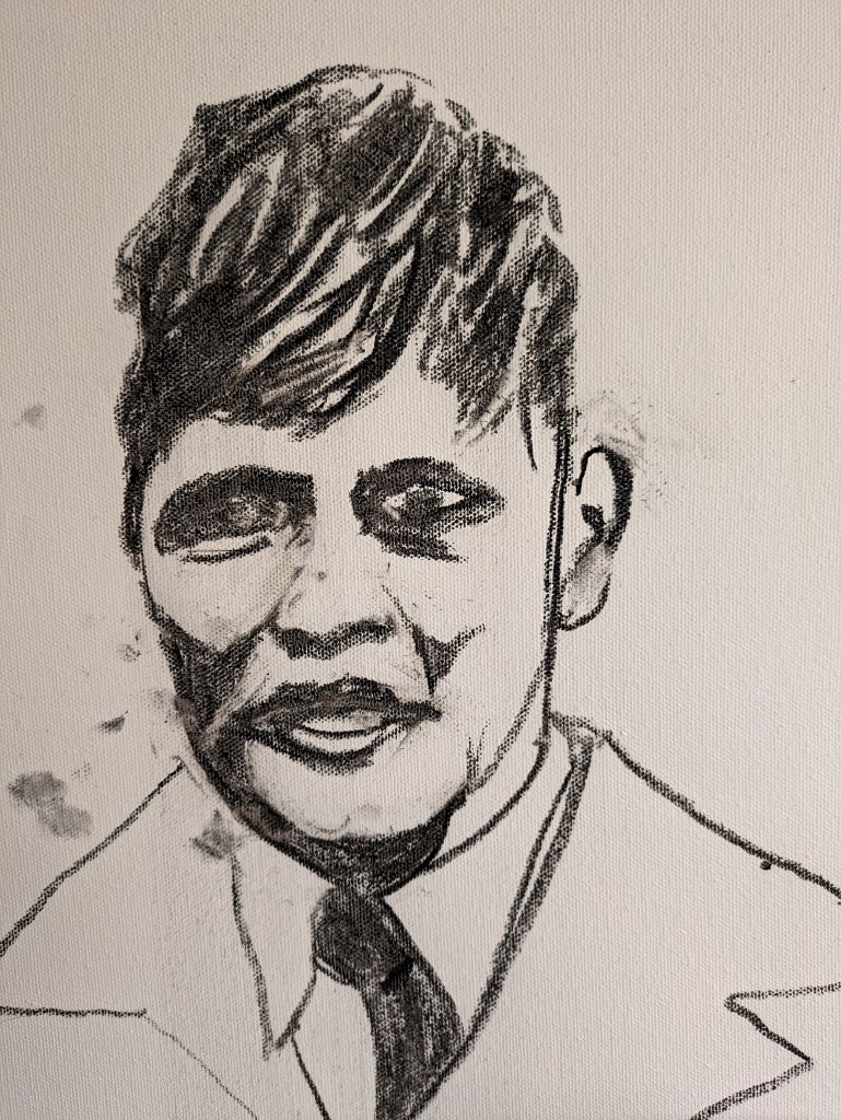
This image is a close up of the head and body. I think I’ve got a lot of the main shapes and features in place okay so now I need to revise and refine areas. I want to try to improve and define the eyes and the boy is smiling so I must not forget this. I also need to clean up the smudges.
I return to Dennis again today and want to lighten the eyes. I do this with my eraser and make a shape with the eraser that lifts the inner of the eye colour. I realise I can make the eyes lighter. I now need to adjust the eyes a little more but making them lighter has worked. I must remember this when challenged with not such good images. Its all about how overall the tones look together and how they create the form and shapes of the face. Having tested the eyes I also add the background sunny colour. This time instead of using oil paint I use acrylic. I also add in some texture to his jacket. I shall revise this a little and finalise the work. I leave the orange mark on his lapel. I think this mark symbolises my presence with these kids, although some may see this as a bit strange, but I do fell I’m on a journey with them.

I adjust the eyes a little and darken the hair in places. I also darken some of the lines and texture to the blazer or jacket.
I adjust
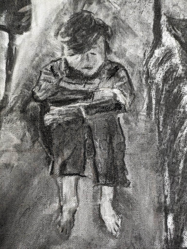
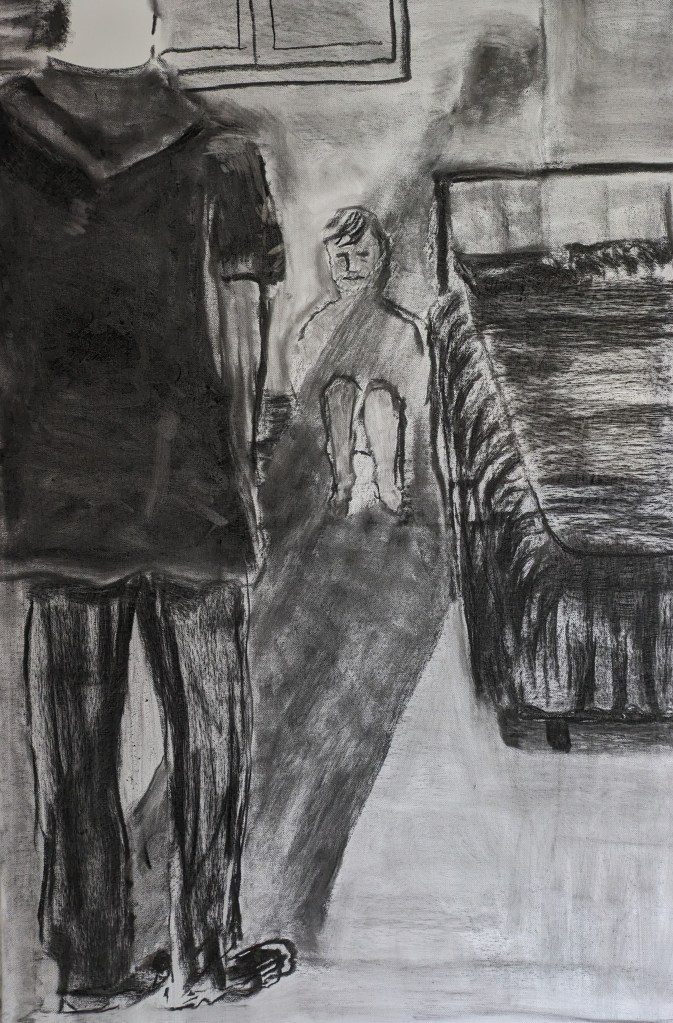
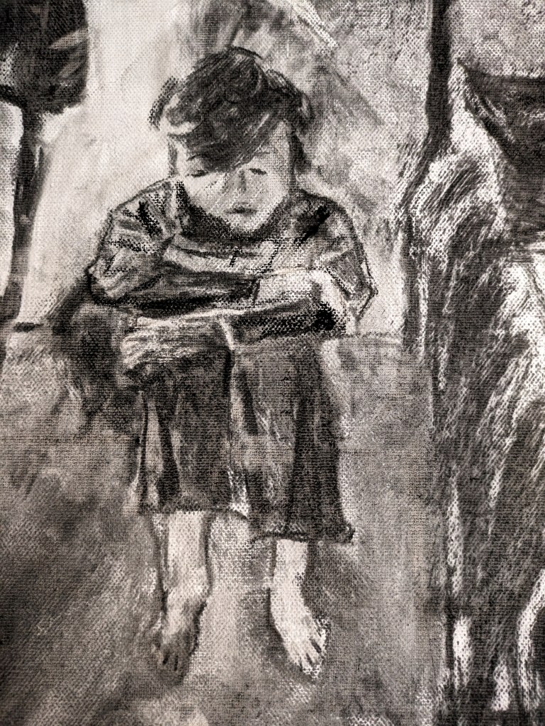
I work today on a work that I tried with a similar composition and in some colour. in part 2. I want to try a slightly different composition of the child in his bedroom. This image could be of any of the children but I see a little boy crouching in the long shadow of the abuser. I’m trying to work on two or three images at a time and return to them for any revisions. When you return to a drawing you do see things differently and its good we’ve done an exercise on this. For these works I am using larger canvas 24x36ins.
Apologies for not many photos but its hard to stop as the charcoal is so messy. I stop her with this one as I need to work more on the child and refer to previous drawings and I also need to alter the window frame and the overall colour and tones in the drawing.
Another day and I return to this drawing. I want to finish it for the crit in part three! I’m not happy with the child and want to re-draw. I also need to give some attention to the adults neck and head. I really erase the child’s head and some of the body. I’m having a little trouble with the composition and the child’s stance in this so I refer to a previous drawing I did of a child crouched. This helps me to decide on the child having their head bowed down a little and their hair hanging almost over their face.
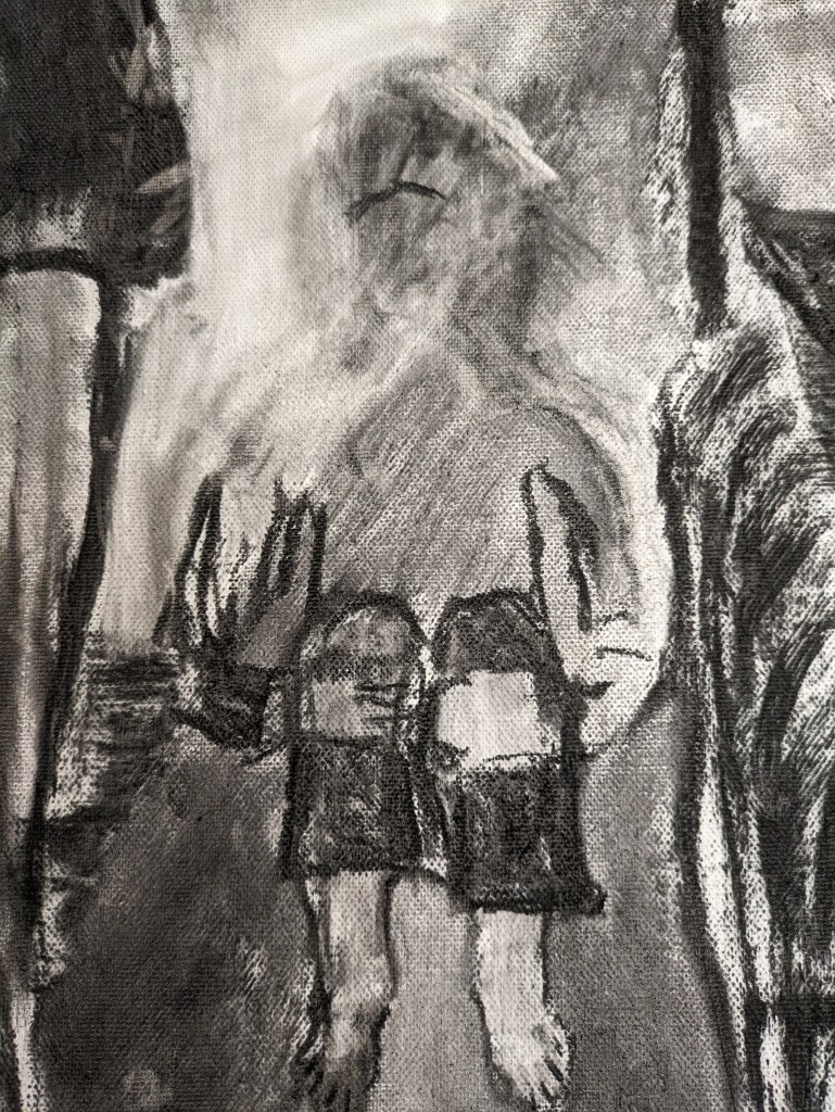
I include the next image as I start to use the erase to create the facial features and the boys hands and upper limbs. A lot of abused children might crouch for comfort or to protect themselves. They can also role up into a foetal position for comfort.
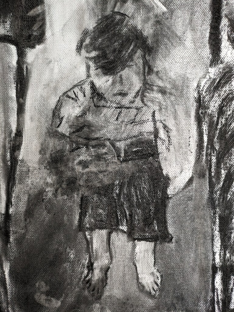
The next image shows the drawing of the child more fully complete. He is wrapping his arms around his legs and I’ve used the tiny pencil eraser to sculpt the hands.
I’m much happier with the child so I move to finalise other areas such as the window the shadow and the adults absent head. This image is about the real imbalance of power between the adult and child. I hope it reflects this and the viewer sees the vulnerability of the child huddled in the darkened room.

I look at the drawing again and there are still a couple of issues with the child but only small ones!. I adjust the child and make the drawing more defined. The final image is below. There are two shadows of the boy and the adult.
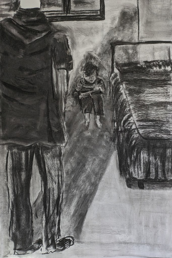
I include a close up of the boy and I’ve defined more the boys arms, hands and body.