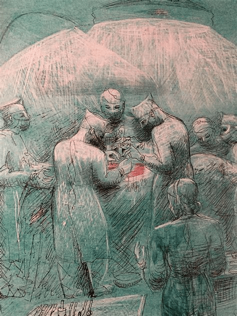
I continue with a drawing I’d just started in part 1. The drawing is constructed from a real photo, however the people are not recognisable. It is about valuing the birth of a child. As you can probably see the child was delivered by caesarean. I was inspired to draw the image by Barbara Hepworth’s hospital drawings. I include one that was in part 1.
My drawing is on a velour surface and this is new to me. The drawing as I left it is below.
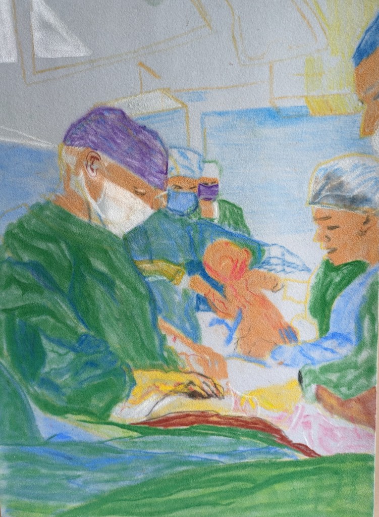

I keep working on each area building up the covering now in the background and ceiling. It’s a peculiar texture to work on. In some ways its so soft and easy to cover, however the pencils for detail can be a bit less effective and harder to apply. It loves the more softer pastels.
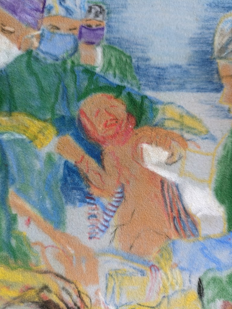
I include this close up as I work on the baby and the towel that she is half wrapped in. You can see more fully the texture of the velour. It does holdthe colour quite well.
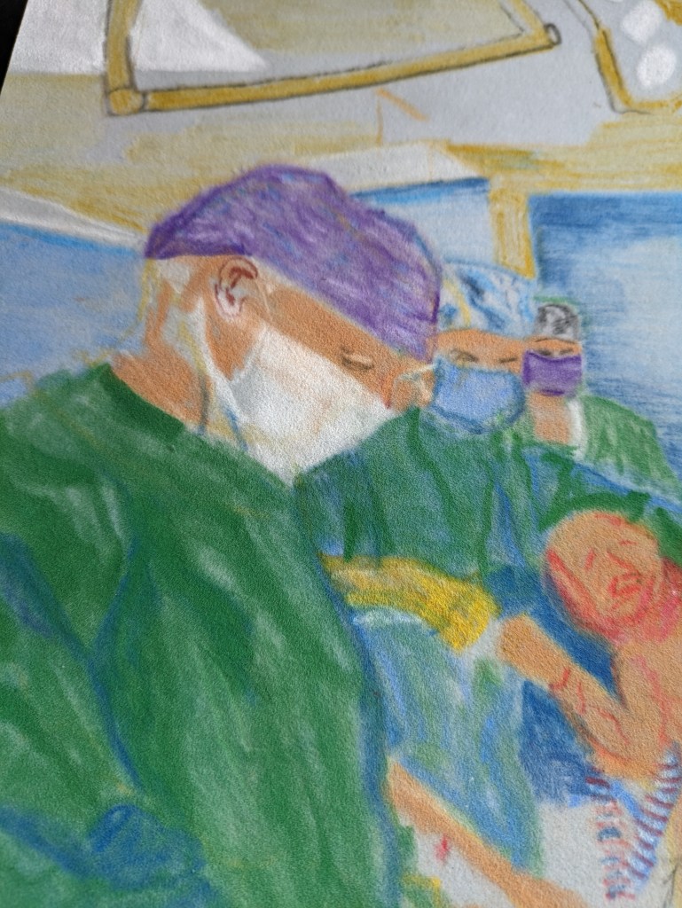
A closer view of the surgeon.
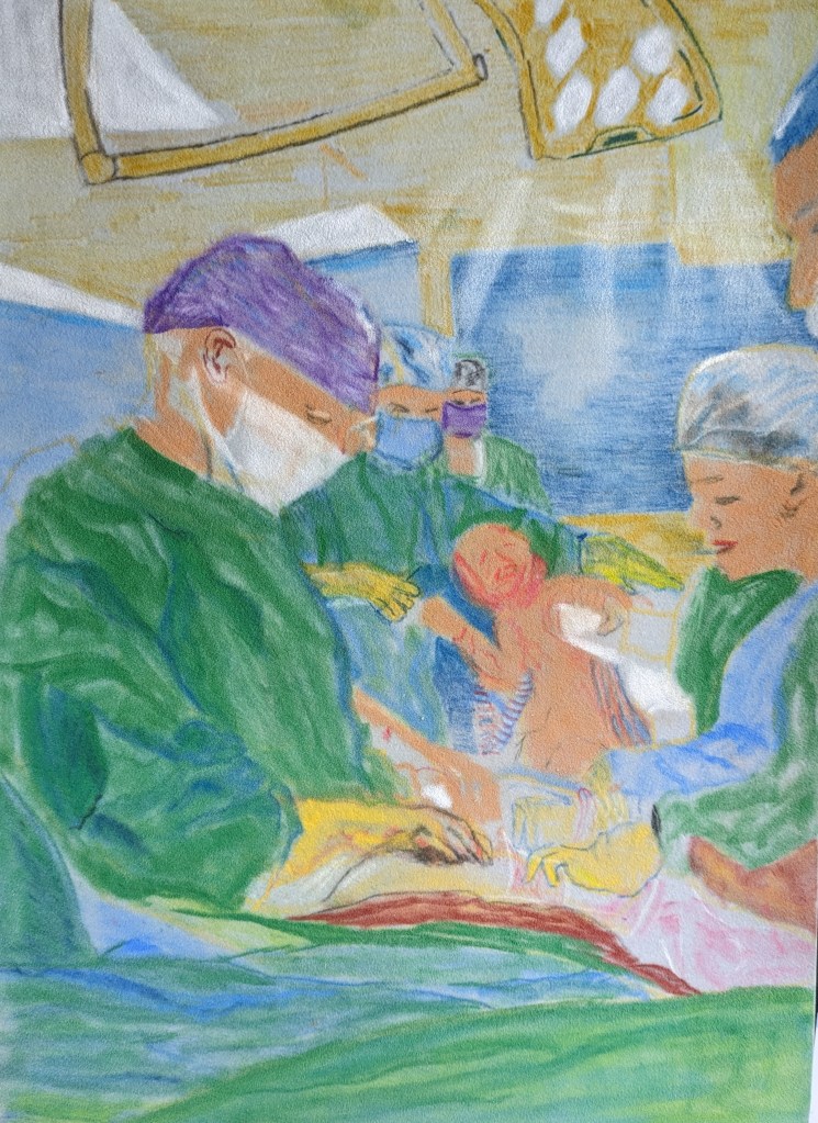
This image shows more light from the lamp. I’ve highlighted the nurse’s head cap with a tinge of white as the light falls on her and also on the surgeons cap. I’m still working on all the finer details.
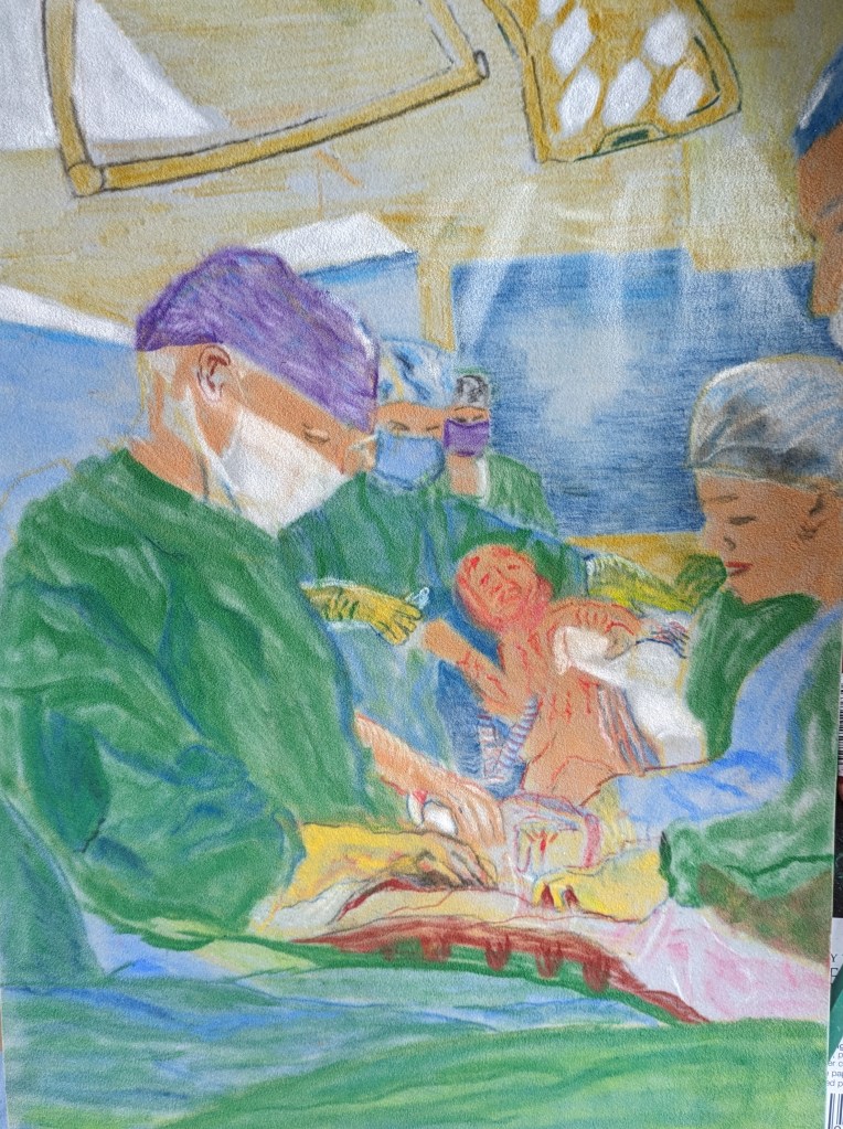
I’ve added a few more details to the baby and most of the hands look a bit better. Some outlines around some shapes provide better definition but it’s now about how far I go.
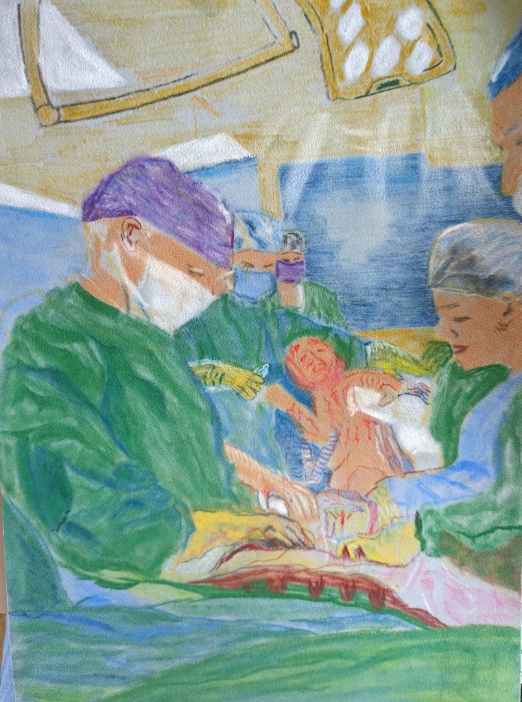
I’ve enjoyed doing this drawing despite the peculiar texture. This is a caesarean birth and the baby does look a little distressed as sh’e pulled out. I’m still not sure that this is finished as there could be more definition in places maybe with an outline and I could also make the foreground a bit darker.
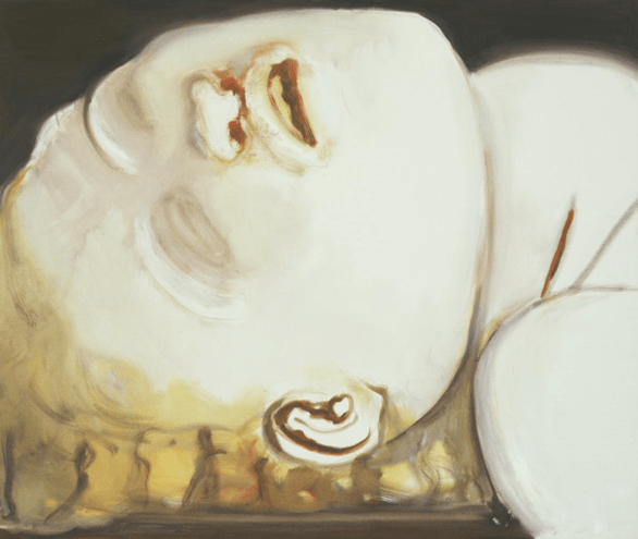
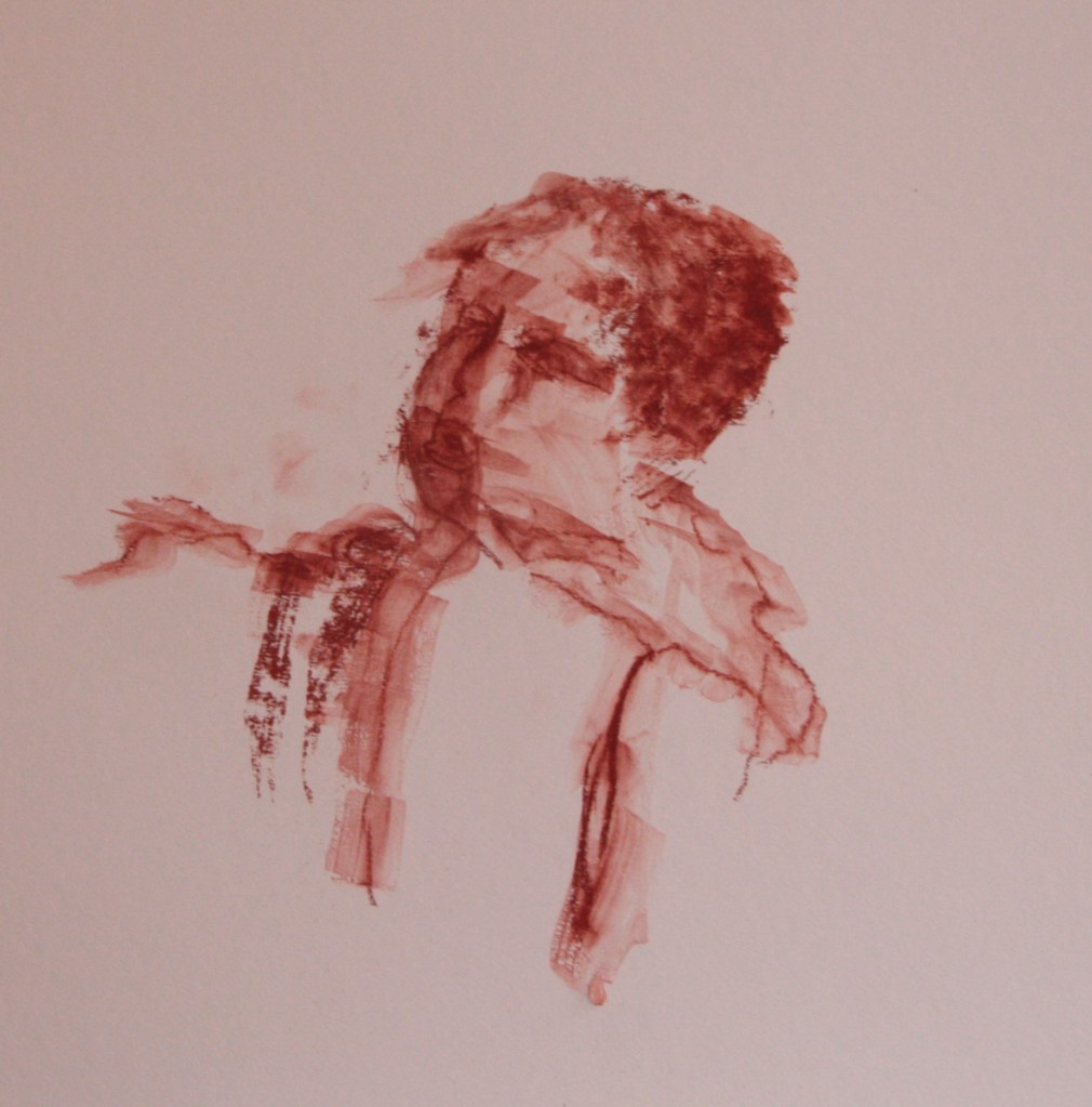
My next drawing is about the young child and their vulnerability. I’ve started to read some of the case enquiries and my next two drawings are the images that initially come into my mind. In this drawing I also wanted to explore more of a sepia or burnt umber colour. I was inspired by some of the Marlene Dumas works which also relates to these drawings. I’ve now made up a separate folder that includes all my research on her drawings. A couple of examples are below. The image is 1303x1103x24mm and it is an oil painting on canvas. I obtained this from the Tate Website and the painting is called Lucy. It was derived from a painting by Caravaggio titled The Burial of St Lucy. 1608. You are immediately struck by the size of the head in relation to the canvas and this gives the image quite an impact. There is a serene beauty to the image despite the injury to the neck. How you present the image in size is crucial so I shall really bear this in mind when drawing more images. The link is below.
‘Lucy‘, Marlene Dumas, 2004 | Tate
I was also inspired by a Leonardo da Vinci painting below titled The Virgin and child with St Anne. The colour adds real warmth and softness to the scene. My tutor raised the issue about adding colour. I am mindful of this as I begin as I don’t want to depict a warm scene.

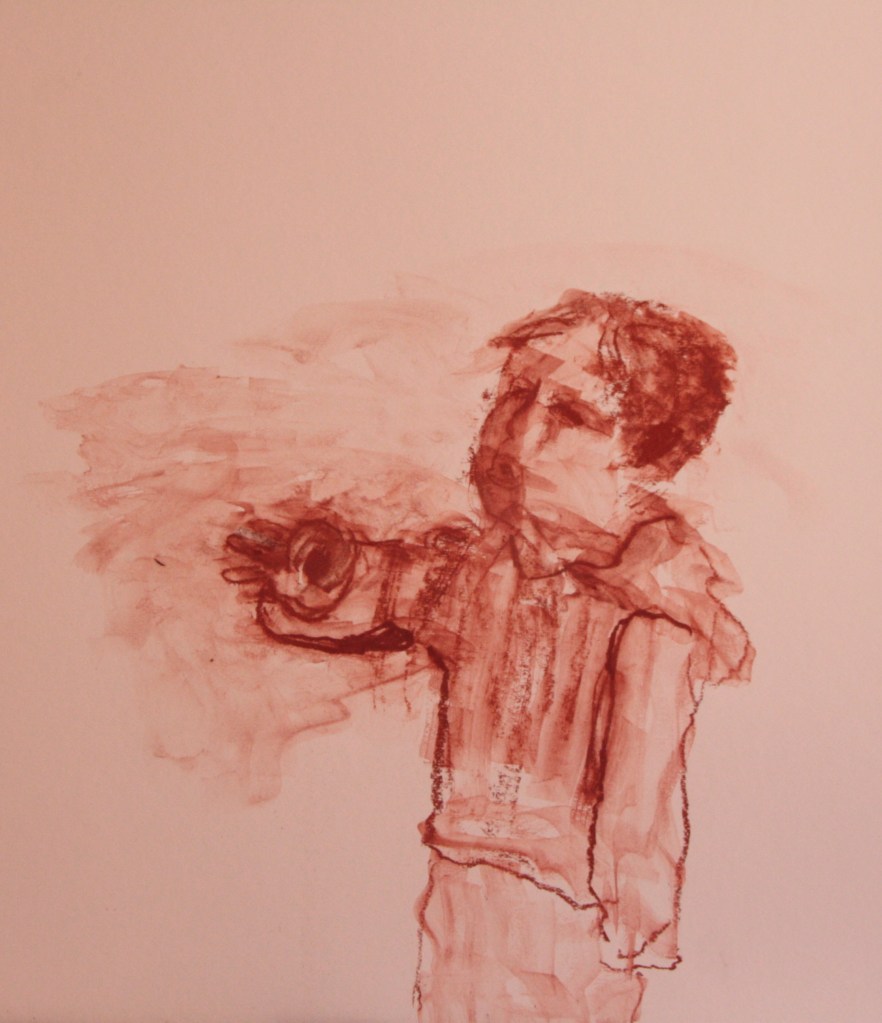
For this drawing below I chose an internet photo. I’m trying to convey the vulnerability of the child looking upwards to the large figure of the parent or carer. Similarly to the work of Dumas I am trying to capture the emotions in my work. The composition I shall test out a little as I will complete a larger scale one like this on a canvas. The size of this work on mountboard is 58cm x 40cm and its on a white coloured board. I draw the main outlines of the face with broken line and I’m using an indian red conte crayon. I deliberately want the figure to be blurry in regard to the features. Once the drawing is complete I use a large flat watercolour brush and wet this with just water. I work quickly and wash over my figures outlines and main features. I take off excess water and keep rinsing the brush and I’m careful not too rub over too hard. As I work quickly I haven’t taken photos in too many stages but I will be more confident with the next drawing and stop. This feels like I’m taking risks with the process and I’m really not sure how it will turn out.
As I look at this drawing I’m quite pleased with the results. I move on to more of the body and the next figure in the picture.
As I work more on the fuller body I realise that I could have put more of the whole figure in my composition. The hand isn’t quite right. In the photo the child is almost pinching her thumb and first finger together. I question whether this matters too much or whether I rectify but rectifying makes it more defined and do I want that effect. I don’t.
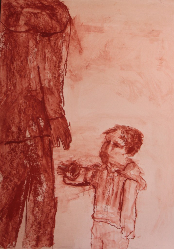
As I move onto the second figure I have a lightbulb moment as I draw in the potential head. Should I draw in the whole figure? My tutor has questioned and made me think a lot about what I’m trying to convey to the viewer and she mentioned how I had used the term gory in regard to creating difficult images. Having looked at a lot of the different artists that are portraying death or dying a lot of the drawings are very beautiful almost ethereal and as such I’m really looking to create beauty in death or dying. The Dumas image above is beautiful. These children I’m depicting are beautiful. I think more carefully about this drawing and again I’m questioning what I’m trying to convey. The essence of this drawing is about vulnerability and a child trying to reach out looking up and trying to connect with the unresponsive carer. I quickly work as the image appears in my minds eye and I lose the head altogether. It is mainly the arm and more importantly the hand being present.
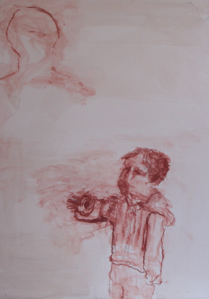
The drawing evolves to this image below. I work in a little more colour to this adult body and the outlines I make sure are quite strong. The hand isn’t connecting but is there. What I might try in another drawing similar to this is just a large outline of the figure to represent more nothingness. I do think that the narrative is strong and that the child is trying to connect with the adult. I quite like how the roughness of the outlines and lack of body to the paint helps create some mood or atmosphere. I’m becoming more and more conscious that potential abusers and murderers are in some of the images but I don’t want to give them any substance…the nothingness suits them. Their very presence in whatever form contrasts with the vulnerability of the child. Barbara Walkers work comes to mind where she is making her black soldiers visible and giving them recognition in her drawings. In one video we see her erase the figure to demonstrate their nothingness. Similarly to her idea I must strive to represent the abusers nothingness in ways that they are still present. I write this here as one ideas may be to use large shadows like Plato’s cave and another idea is about using just outlines. As I reflect on the drawing what I’ve created is the illusion of shadows cast from the figure onto the child’s face and body. I will test out both of these ideas in other drawings. I mustn’t lose sight of this idea. I could also use Plato in my research not just about the shadows, but it’s about the personnel responsible for these children..that did not or would not see!
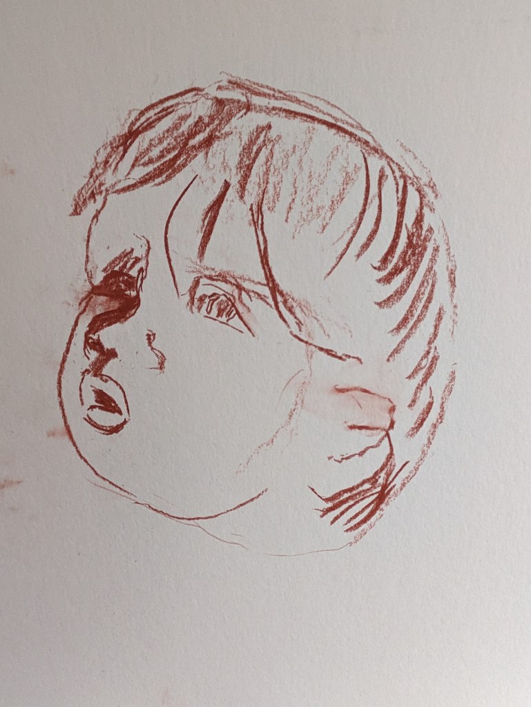
This next drawing is again with the indian red colour on another white mountboard and I complete a portrait of the same child, just head and shoulders. I draw this and take more photos as I go along. The size is 50cm x40 cm. I use the conte crayon again and these are like a hard charcoal in substance. The first outline drawing is below. The nose and left eye are not quite in alignment so I will try to adjust
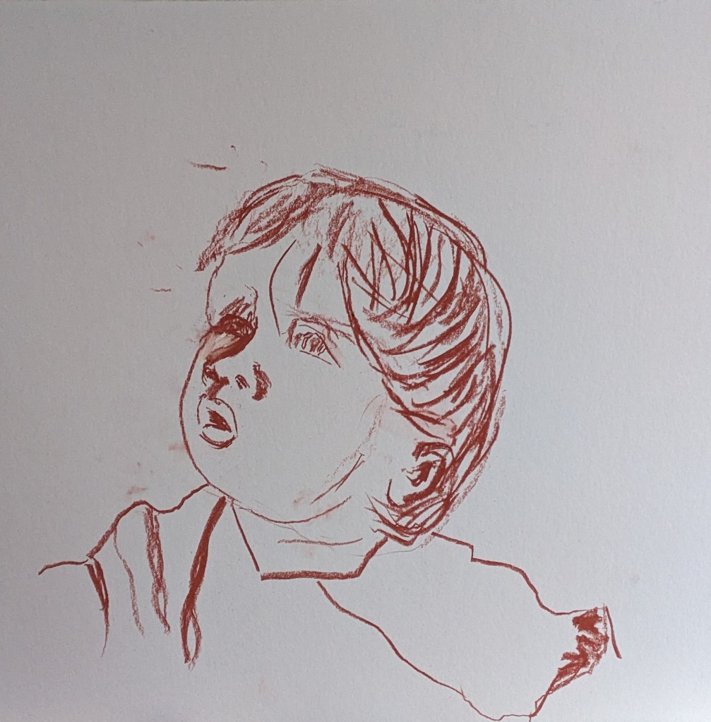
I work quickly again with the working over with the wet large brush. I re-work in some of the colour in the hair while still wet. The eye and nose are okay now as the nose has some shadow and this works well. I deliberately don’t colour in much on the right of the face to give contrast with the light on the right and darker on the left. I think this works well. I tried to create some emotion with the child having a couple of tears.
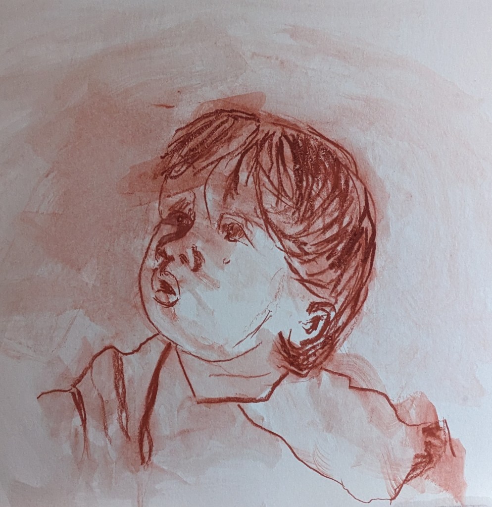
As I work these drawings/paintings I’m very conscious of the fact that I’m using similar techniques that I’ve learned with the charcoal. For example using the broken line and erasing. Similarly to the charcoal where I rub in and out in this case I’m washing in and out. As I reflect on the drawings I can see some of the brushwork but that’s okay. I do feel my drawing keeps improving. Again the vulnerable child is looking up and the shadow is cast on the face. While in many ways every drawing is experimental, incidental or accidental these processes are working for me.
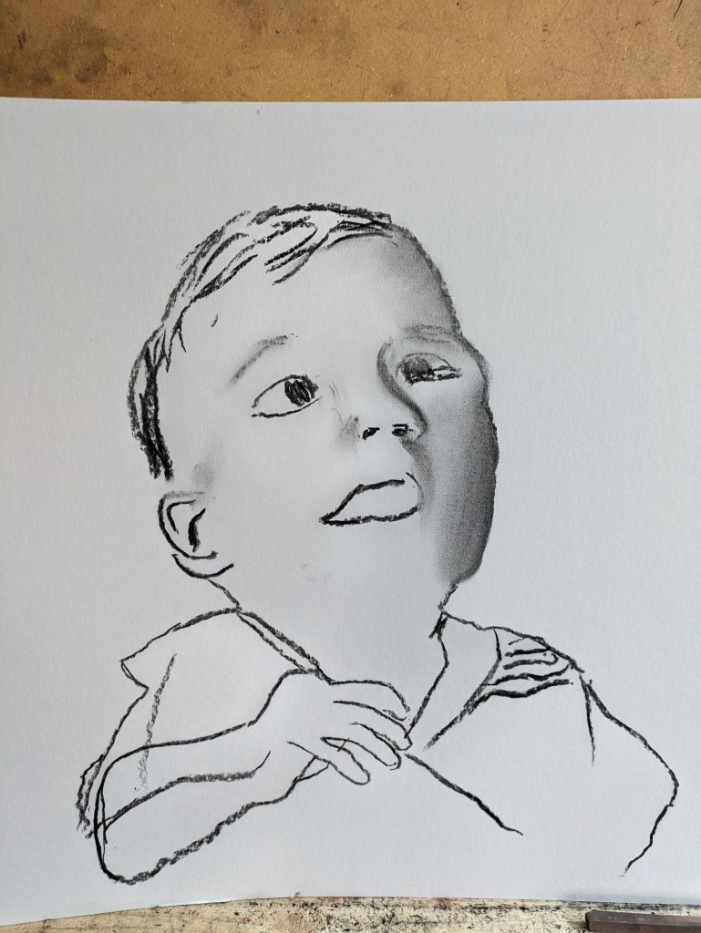
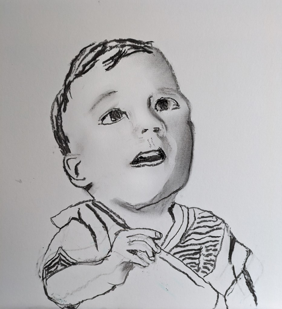
My next drawing is of a child with a reasonably happy face again looking upwards. Apologies for this drawing not being edited but I thought it important to show the piece of wood that I am standing the drawing on so that I can take photos easier. This shows how the drawing beginswith the basic outline. This drawing is taken from copying an internet image.

I blunder a bit with the shape of the arm as I draw the body. I’m constantly referring to the drawing looking for dark and light shapes in the picture plane of the face. I start to consider the eyes too and I just work freely with the charcoal stick and allow it to take me along with it. In this regard I am far more confident and don’t fear the white paper. The next image shows how I’ve rectified the hand and arm. I keep wandering if the body is big enough but I measure again the proportions in the photo and its okay.

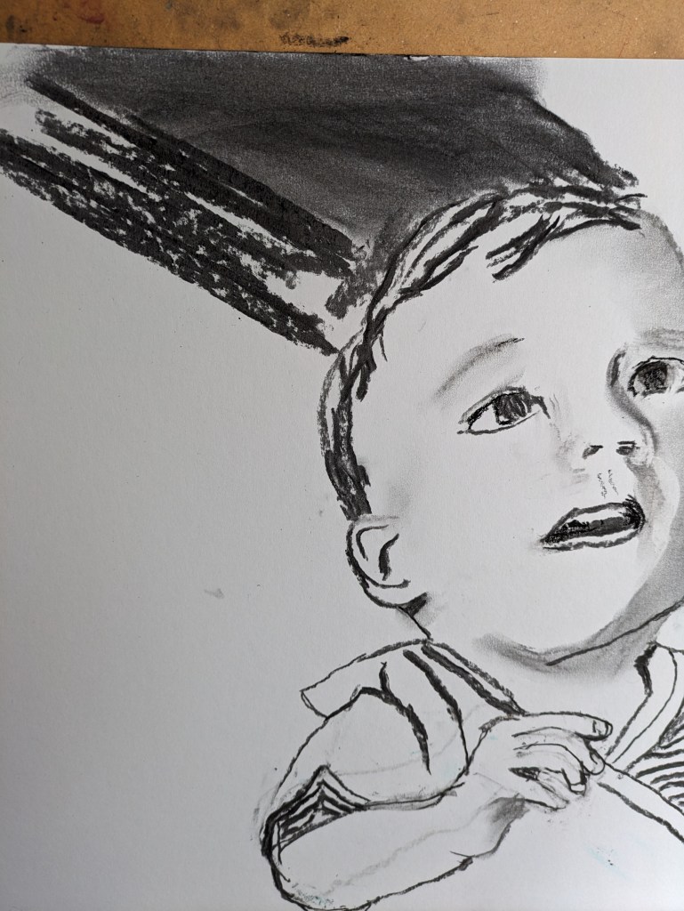
I think its at this stage that I decide to push this drawing really much further. I may use this as one of the drawings in Ex 2.2 I decide to darken the background and see how this works.
I start to see what it might look like. I’m a little apprehensive but just cover up fairly quickly.
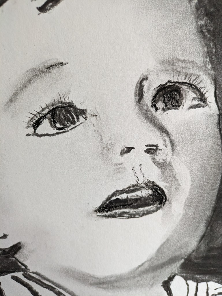
After cover up in the dark soft charcoal stick I attend to more detail in the face and give my little boy lashes. I also allow for some teeth. This image below albeit very cropped is quite effective. I may work on one or two larger images that are really close up. The Dumas painting of Lucy for example is very effective and close up.
My final drawing having cleaned up smudges too is below.
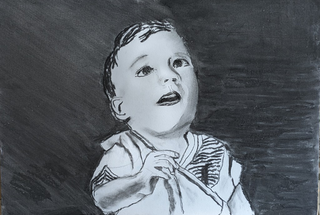
If you look close at the background I tried to lighten the left hand side with an upward sweep with kitchen roll. I did this as there is light on the left hand side of the face and the darker side of the face has shadow. I decide to leave it there but I’m reasonably pleased with how this has turned out. Over the last couple of days I read some of the enquiry reports which have been quite daunting so it was good to do a pleasant portrait.
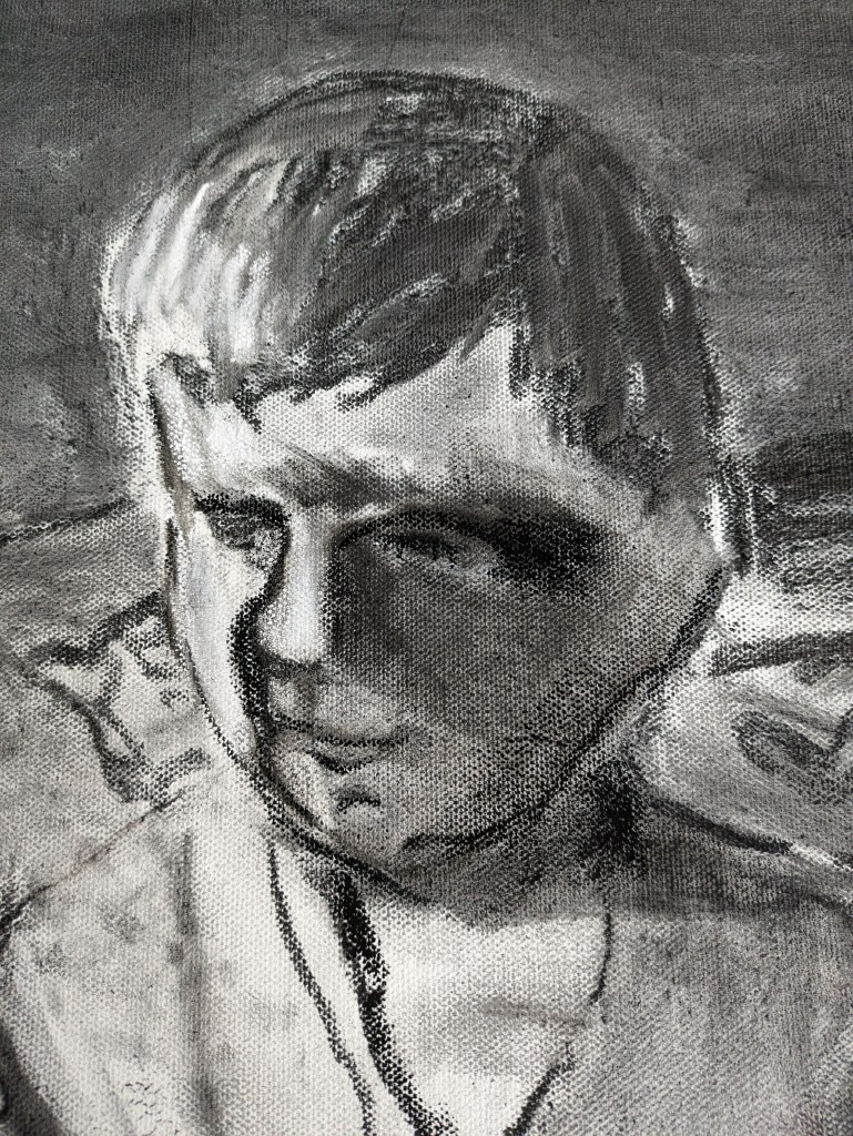
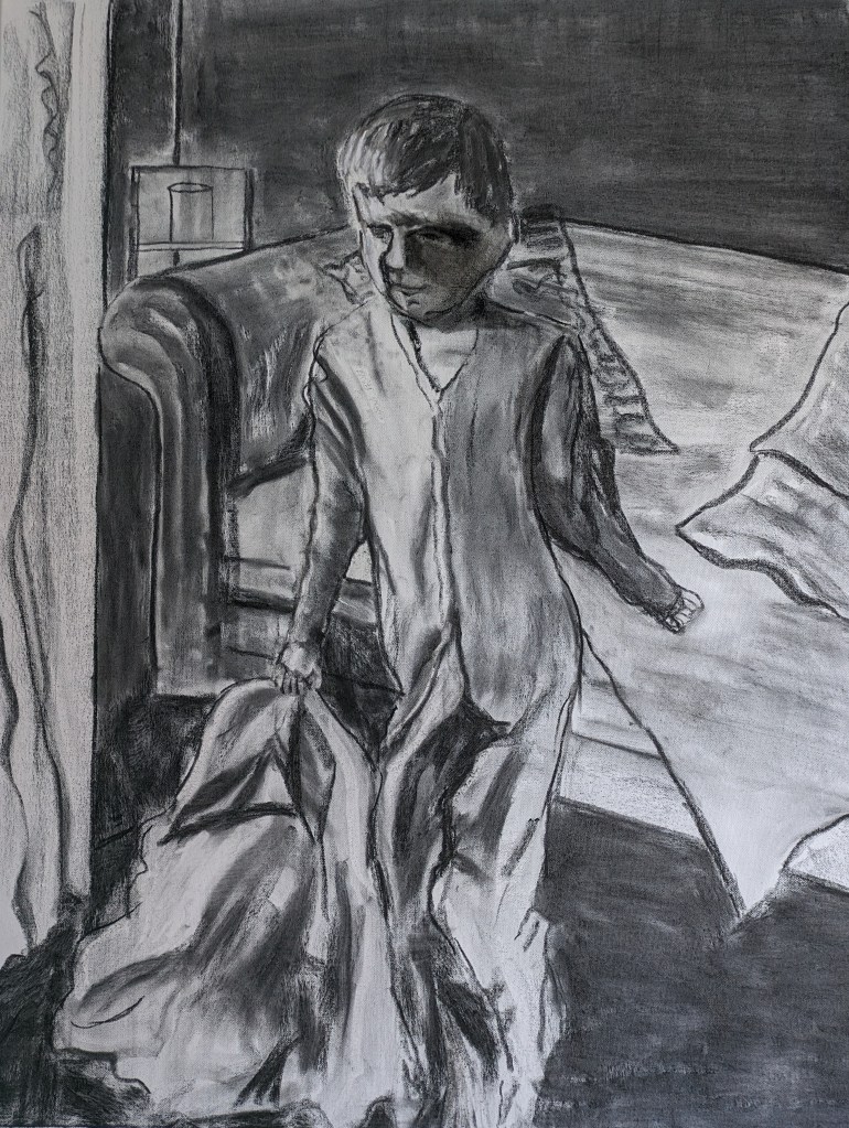
I’ve been reading some of the child care inquiries so I decided to take the plunge. This work relates to a child that died in 2000 and I drew this from the images on the internet that were in the news. The size is quite large 26x36ins and this time I’m using a good quality canvas. Below is my initial drawing outline. I’m going to undertake this one in charcoal. I’ve only used it once on a canvas but it can work quite well.
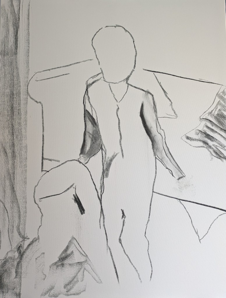
The child has been starved, poisoned with salt and has 100 injuries to his body. He actually died from a brain injury. In the images he is dressed in a onesie and can hardly stand. He’s trying to pull a duvet. I start to work on the photos but also have a very happy smiling one of him at hand too. This helps me to not be too intensely voyeuristic if that’s the right word. I am reminded of what Kentridge said about being witness to such pain and suffering. This will also be important for my research. Such a beautiful little boy. I really hope I can do justice to these children. I don’t particularly want to depict an exact likeness but I hope the scene has some emotional impact on the viewer. If I’m honest the drawing is having an impact on me.
The next photo shows how I start to build up the colour, shapes and tones in the drawing. I also start to create form with the tones.

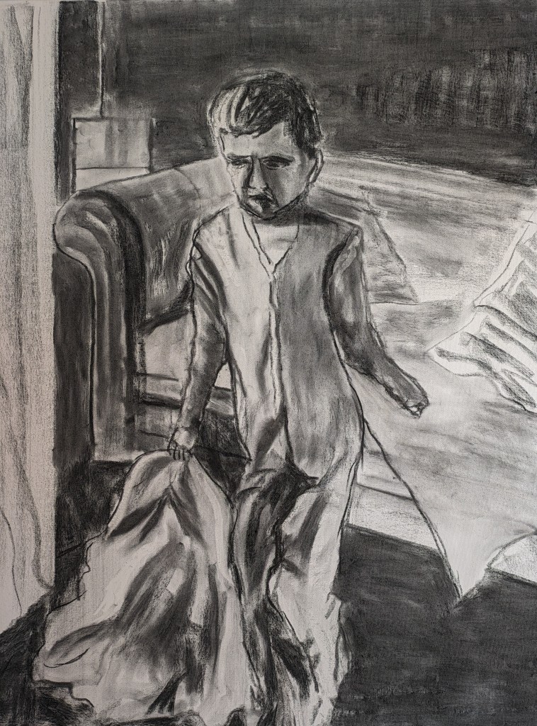
There is a net curtain which hangs from the long window and there seems to be one or two cushions on the sofa. In this regard I am mindful of where more of the light falls on the boy’s face and left side.
I continue to make adjustments and I’m not sure about his face.
Having established his form I can’t help but sit for a few minutes. As I look at the drawing I reflect on how thin he must have been. His feelings and his understanding of what was going on are incomprehensible. The more of him that I’ve drawn, the more I am connecting with this child. I am identifying with this child and I can’t help but feel quite emotional. The moments in silence and reflection is quite serene. I feel very respectful. The strong connection also gives me a sense of strength and eventually the foreboding subsides and I continue the drawing. I must do these children justice. These drawings need to be good enough.
The eraser is also such a good drawing tool. As it rubs out it creates line and form. I’m able to create the light in the various important places such as the left hand side of the face and body. A touch on the left of his hair and in places on the duvet.
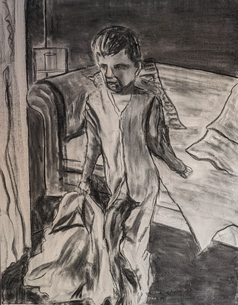
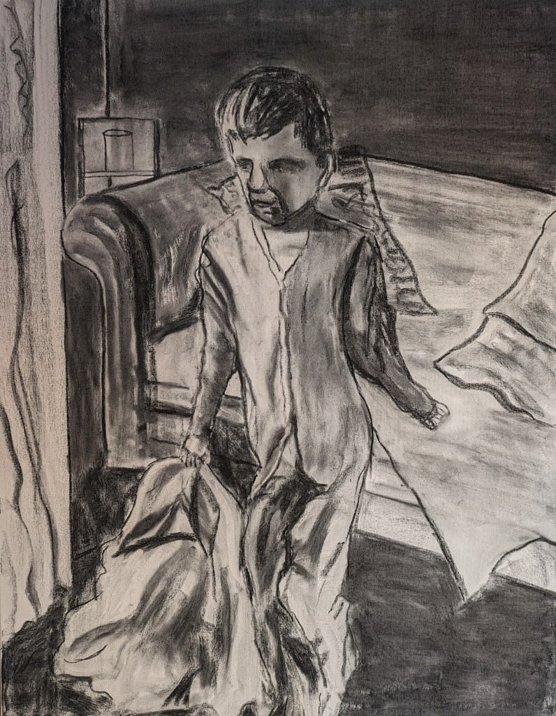
I work in a little more definition in various areas such as the cushions and the duvet. I’m still not happy with his face and return to the drawing the next day. I revise the facial features and I also improve on his onesie where his leg bends. The face looks a little better.
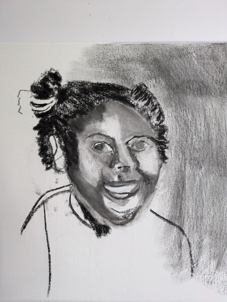
This next drawing depicts a child who was murdered by her aunt and her aunt’s partner. I’m trying to draw on a 20x16inch canvas. The more I work on the canvas it can give quite a soft delicate effect if rubbed in well. I use the stubbs for this. My drawing continues to improve and I just keep adjusting the shapes around the face until I’m happy with where the features should be. My first drawing is below. The angle of the face isn’t accurate. I don’t usually put the eyes in until later but I put some heavy definition in.
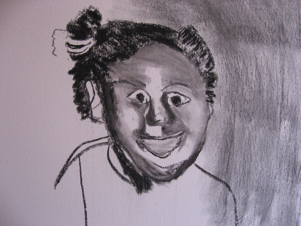
This second drawing shows how I revise the angle of the face and move across to the right some of her features.
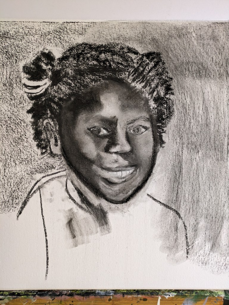
As I keep noticing need for revision as you really need to observe well, I undertake a little background colour to give me some light relief.
I keep working and reworking to capture the light on the face correctly. This light is so important as it also helps shape and give form to the features.
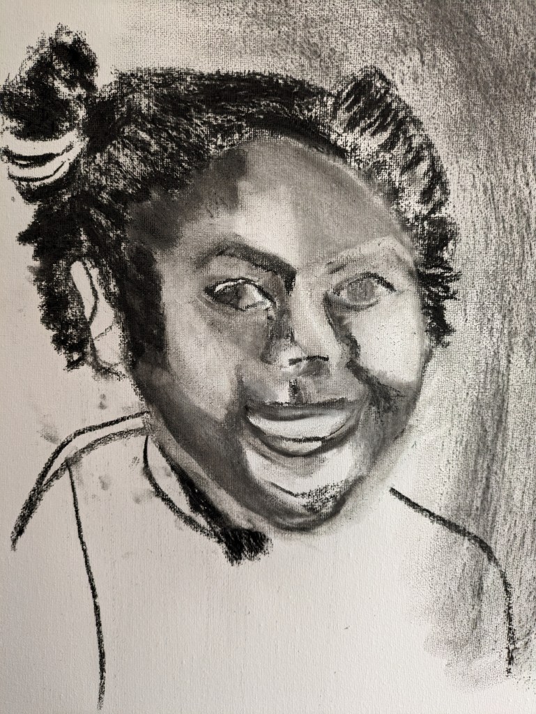
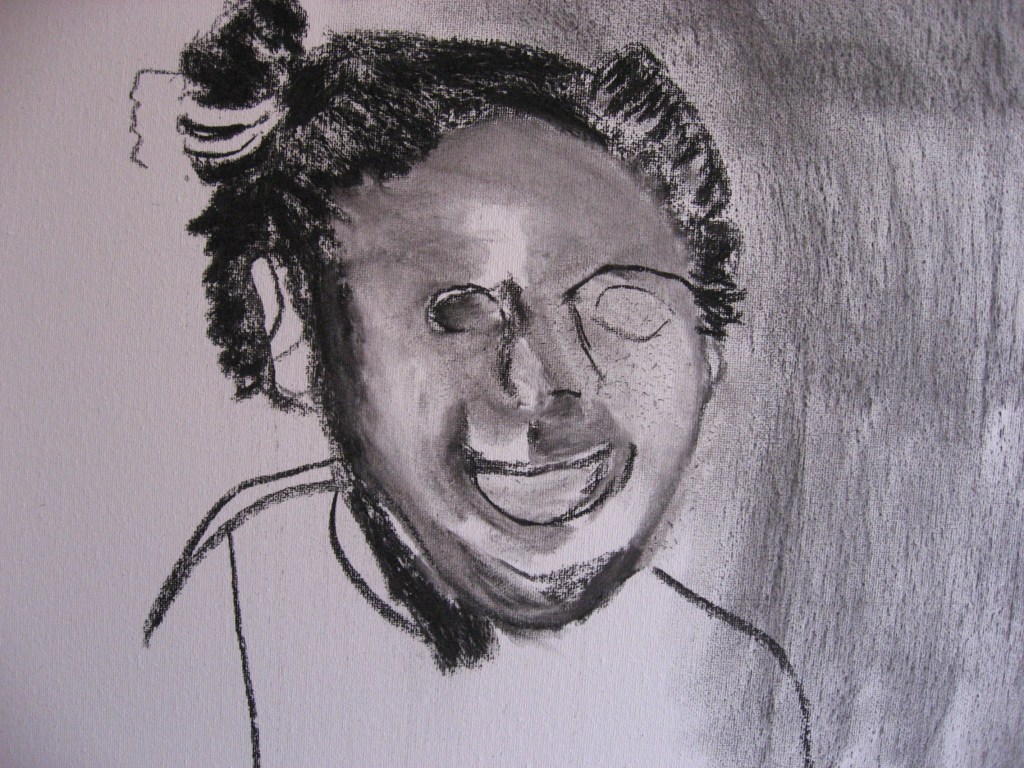
In the image below I realised that the head didn’t look quite right due to the overall place of the hair. The image shows this revision and the face then seemed to have a better and more natural shape. She has bunches either side of her face and I keep rubbing in and out and drawing with the eraser.
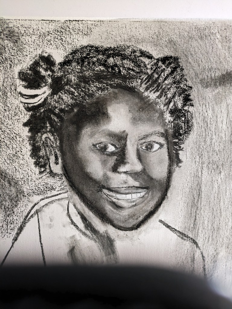
I think this might be as good as I can achieve with the light and dark shapes of the face. I’ts been like a cat and mouse game adjusting lots of times
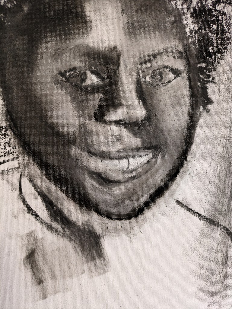
I play around a little with a few wipes to the background. I’m tempted to paint the background in a bright orange. This child had such a beautiful smile. I want to celebrate her life with brightness. There is some shadow in the background of her head in the photo but I may just go orange oil paint. I’m reminded of Hockney’s portraits when he gave them all a bright blue background. As I’ve worked and reworked the face I’ve felt the same connection to this child. I feel I know her so well.

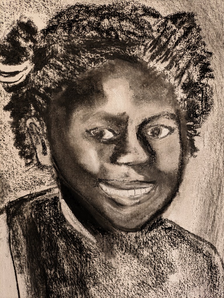
I’ve not included the original photos of the children but I am quite pleased with the likeness. I will share with my tutor and discuss this issue further.
The other drawing in this part of the course is the one I’ve drawn and included in Ex 3.1.
