The web link suggested for the artists research centre was a risky site so I couldn’t access this. I managed however to find a webpage as below on Becky Beasley’s installation work.
https://www.tate.org.uk/whats-on/tate-britain/art-now-becky-beasley-outside
I couldn’t access the second web link either but through google I managed to find the artists website as below.
The artist clearly has an extensive repertoire of work both past and present. Her practice is usually based on research of people and texts. She also writes reviews on exhibitions and has a newsletter.
With regard to the artist Dr Catherine Baker. I really like some of her drawings. As I read and looked at her work it was clear that extensive research was taking her on different diverse pathways with her artistic practice. The video on her website titled waiting was very thought provoking and powerful, as it was about people who were seriously ill either waiting for treatment or diagnosis.
As I begin to map out ideas I can see that research is going to be so important in so many diverse ways in regard to my current thinking and plans. I am conscious that each cog in the wheel as it were needs to be underpinned well in contextual research. I’m also conscious that I am now needing to write far more critically about mine and others work practices or theories.
Exercise 2.1 A continuing practice
Charcoal is likely to be the main medium for the work on project YOY. However I am going to continue to experiment with pastels and probably oil paints. I feel confident to call my project and exhibition YOY now as I am sure that this is where I am headed. I will explore more of the other medium I favour which is biro, but as my confidence grows I am researching more about style too and other artists that have used the medium. The other artists I am considering apart from Walker and Kentridge are one or two of the more classical artists such as Degas, Renoir and even Picasso.
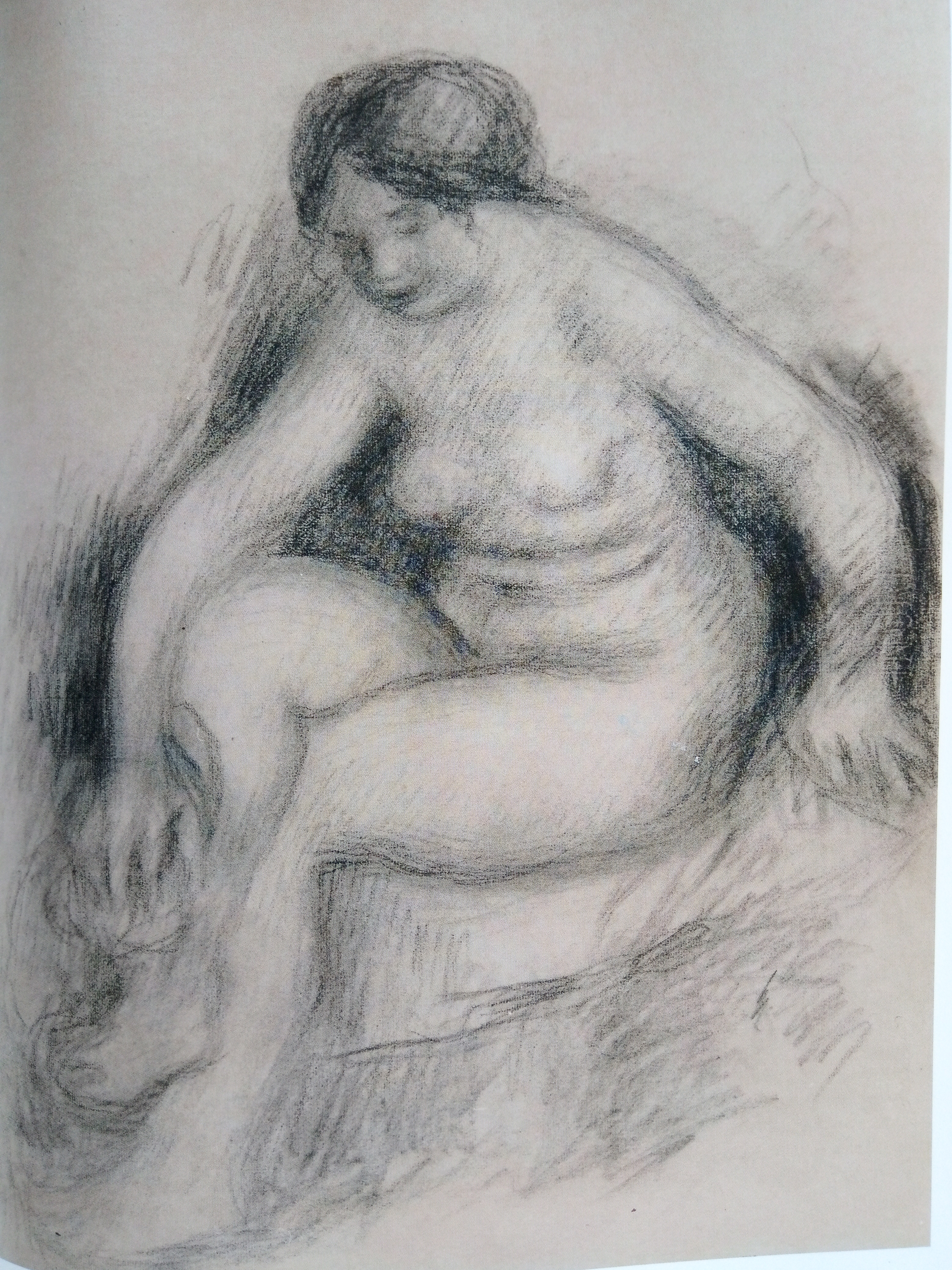
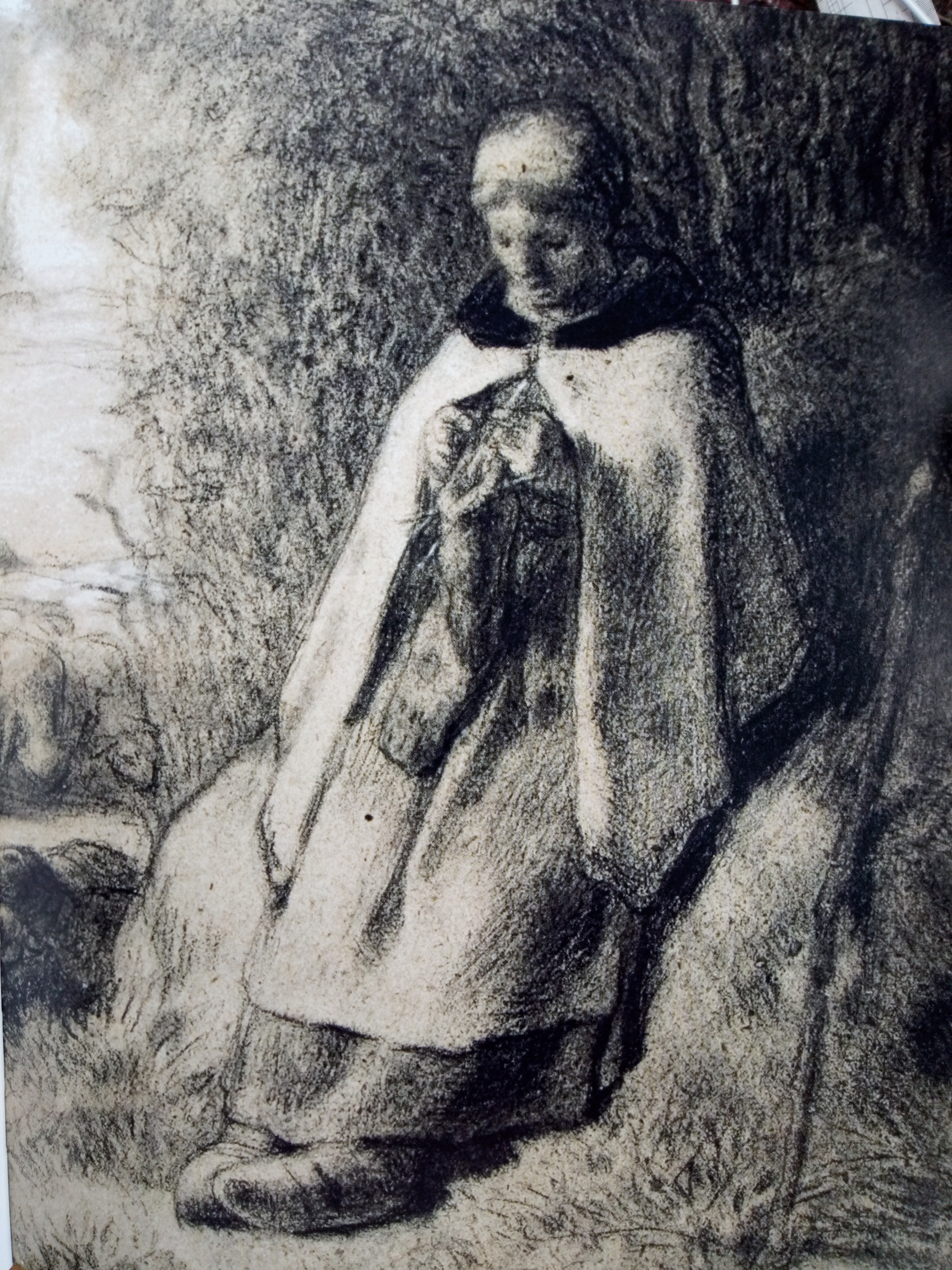
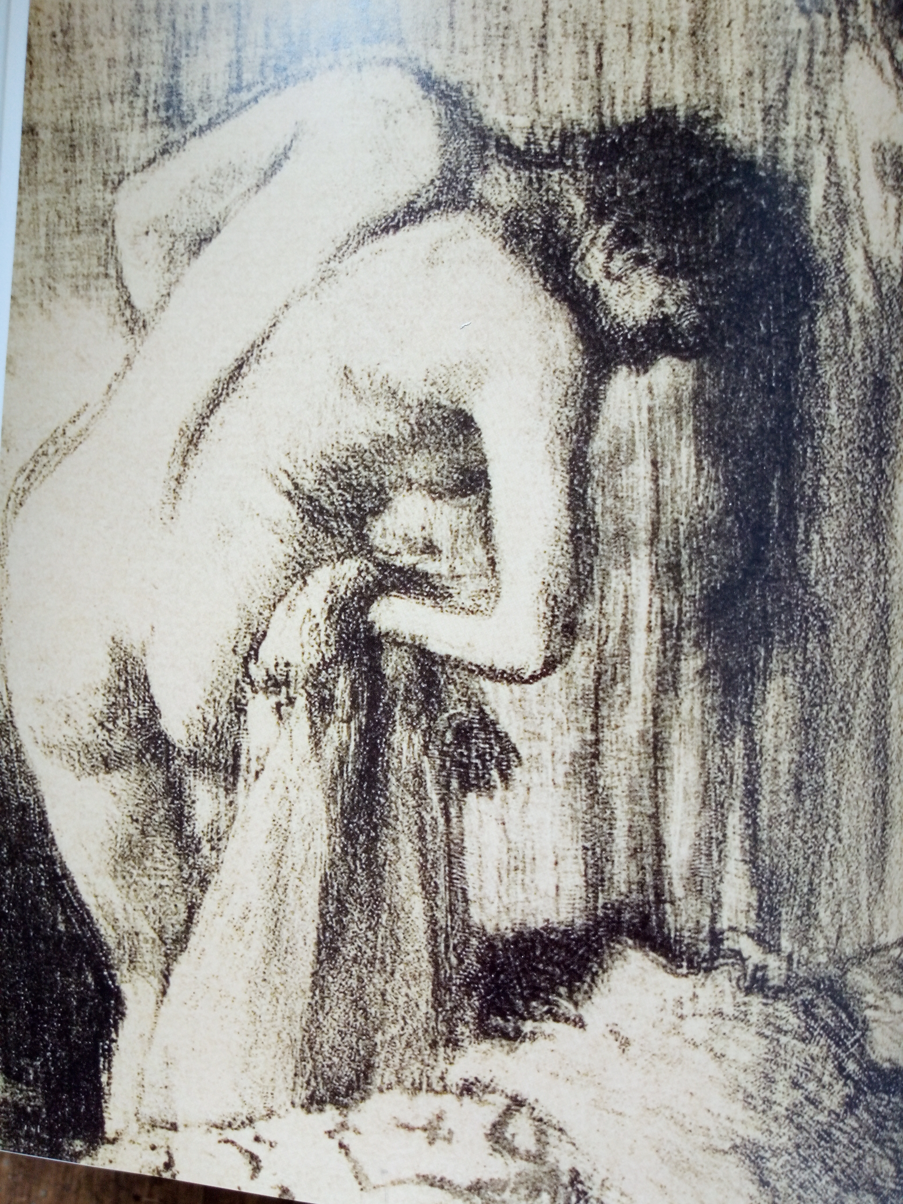
Below are four images in charcoal. These are taken from an exhibition catalogue titled Degas to Picasso, Creating Modernism in France. I attended this exhibition at the Ashmolean in 2017. The first one on the left is by Renoir. It’s completed on a pinkish-brown wove paper. It is 64×48.5cm and it is titled Bather Drying Herself. This is such a beautiful drawing and although we can see all the lines of each stroke we can also see how subtle and soft each line is. There are darker and heavier areas in the shadows of the body. The lines almost follow the same sweeping direction and the lines also contour the body. The second drawing below on the left and the one on the right are works both completed by Degas. The drawing on the right is titled After the bath and is a small plate lithograph. The drawing on the left is a pastel and charcoal. Similarly to the style of Renoir both use this classic line style to create the form. Degas has used heavier outlines on the body. The third artist in the middle section is Jean-Francois-Millet and the work is titled Shepherdess Seated on a Rock. The artist has used similar line techniques in places but he’s used the background with heavy charcoal to depict the trees and foliage behind. The background is clearly toned and on the left hand side we can see some chalk whitened areas that lead the eye to the distance. The toned background works nicely for all three artists.

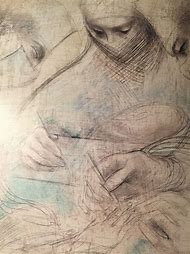
As I approach my own drawings in charcoal I do have to admit that I am quite heavy handed. In this regard I do debate whether this heavy line and application will be effective in my practice. I consider some of the work of Kentridge who uses heavy dramatic marks and lines to create his figures and their features. I include one of his other drawings below. This drawing is one in a series called Other Faces. I accessed from the internet google search and this image was with the Goodman gallery.
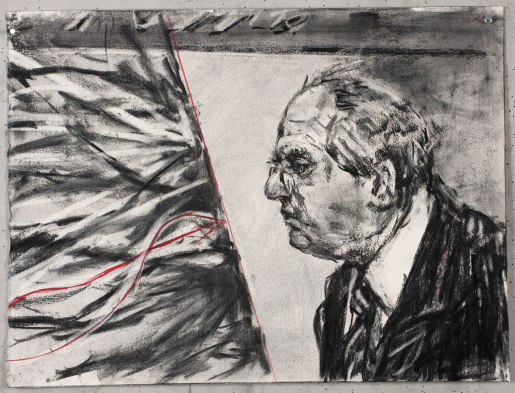
Kentridge is quite heavy with most of his marks. He is heavy and smudges and erases quite a lot. In contrast to the other artists this heavier density with the charcoal does seem to create a more dramatic effect. Interestingly this drawing has some red lines in it. When depicting some gruesome images Kentridge will mark in a red cross where there was an injury on a body. I need to give some consideration to depicting the injuries and I need to test out the drawings. Red may be appropriate but I don’t particularly want to replicate Kentridge’s style in this regards.
My recent drawings are below.
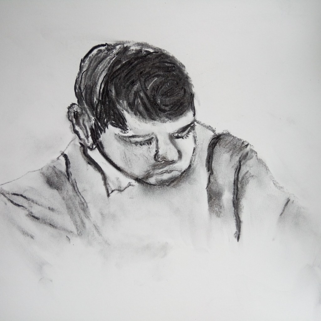
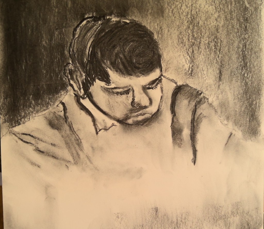
This first one of a boy was a drawing I undertook from the above catalogue and it was a painting by Camille Pissarro. Information from the catalogue suggests the work was done in pastel on a blue-grey paper. In contrast my drawing isn’t intended to be an exact replica. I’m using other drawings or images just to practice drawing facial features and shapes. My boys head is at a slightly different angle.

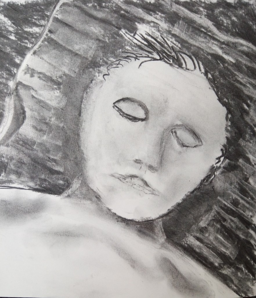
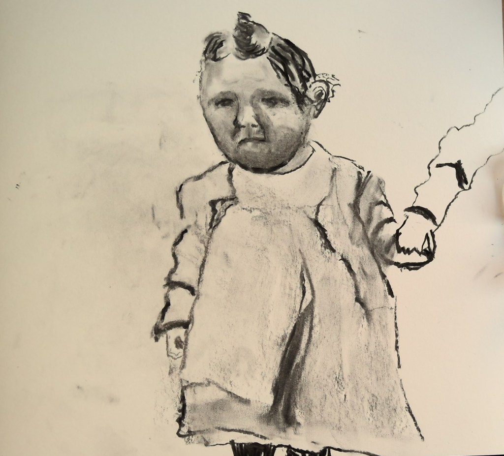
The baby below is a friend’s child and she sent a photo for me to copy. Neither of these images are meant to be gruesome. The boy is meant to be very pensive. What I think I’ve achieved is capturing the physical features and where the light falls on the face. To make the images more dramatic I could have darkened the background. The third image below is just created from my imagination. A young child or woman sleeping maybe? The pillow and background are dark. I managed to capture the contours of her upper frame with light areas. The drama is about the contrasting dark and light shades.

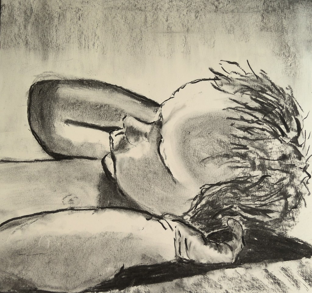
The third image below is of myself as a child aged around two years old. My cousin Stephen and I were holding hands. Looking at old photos and using these to help with the drawings is good. Some of them are in black and white and in some ways this also helps with the dark and light shapes.
As I looked at the first two images I’d drawn I decided to darken the background as I’ve done in the image of the baby and the boy. There is clearly a little more drama through the use of chiaroscuro. This is a term given to the artists who use the dark and light contrasts. I must add this term and explore it more in my research. I am also researching the term tenebrism and I shall explore the differences between this term and chiaroscuro as they both relate to the contrasting dark and light.
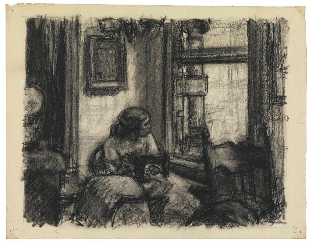
In this next drawing I’ve tried to take photos when I could. This first photo needs some revision but the drawing is about a child being physically sick through fear invoked by parents being violent. I hope to demonstrate my processes and I include as above some other artists work to compare the contrasting dark and lights. I shall use Hopper for this one. My fist image shows the vomit being a little excessive and there’s no differentiation with some marks on her dress. The work is still a bit smudgy. I’ve deliberately made it a bit aerial in view but the kitchen units need some colour. The rush mat I haven’t finished.
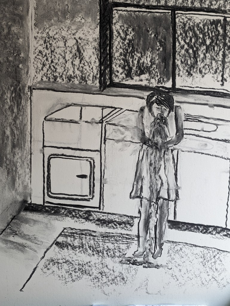
This drawing above is predominantly dark with just the window being light and the back wall. Smatterings of light on the woman and her work emanate from the window. I like how my figure is hunched and the clutching of her stomach works well. I will go darker with the units and clean up the smudges.
It’s hard to keep stopping and starting for photos with the messy charcoal. Once I’m proficient with the new camera I shall attempt a video. I persevered more with darkening areas and lightening. Similar to the style of Hopper I wanted to create more darkness. It’s good to just keep practicing drawing and I’m loving some of the effects. I also created more accurate perspective lines with the use of a ruler. It’s still not perfect but I’m not seeking perfection. The image is below. I like the texture in the mat and the vase of flowers adds interest.
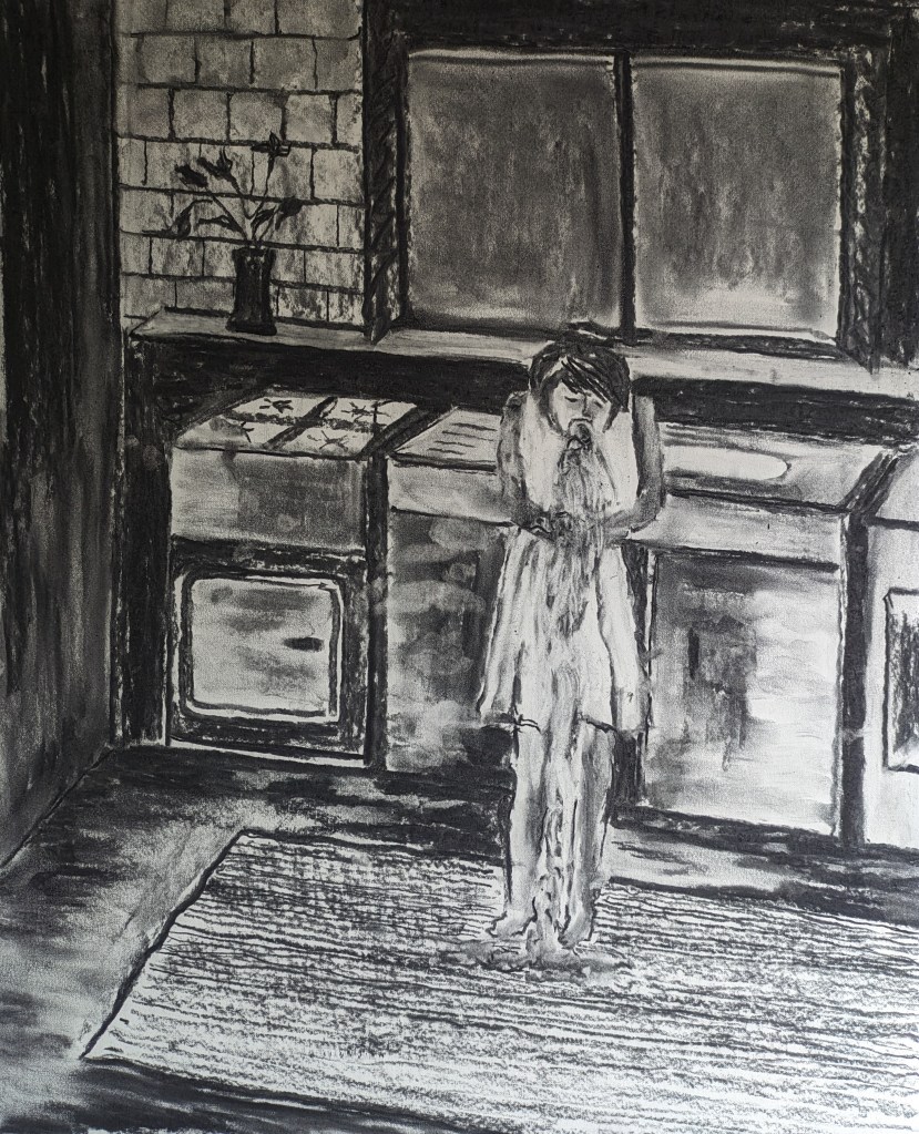
I could add a few more details but I’ll leave it there for now. The perspective is a little better. Adding the darker shades in the background helps throw light onto the figure and the right hand unit/kitchen sink.
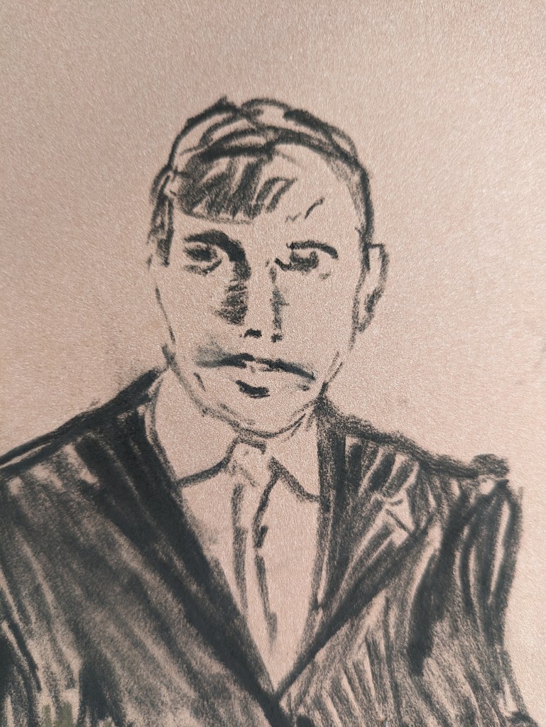
The next drawing is to test out pastel and on a pastel mat board. I’ve only used a mat board a couple of times and I haven’t used much pastel but more oil pastels. As I start to draw the erasure is quite easy even on the matboard. It feel like hard felt. This time I’m thinking about figures for a meeting. A male social worker or manager with parents. As I start to draw I think of Kentridge’s drawing above. I use a couple of internet images to inspire me with the figures but do create the situations and composition largely myself. My first photo includes all three figures although I need to do a lot of work as initially the figures look silly. The manager on the right is smiling and I want him to look serious. It’s very early days. The mat board is coffee coloured so this tones well with the black carbon pastel.
I decide to concentrate more on the manager. I plan to use and continue with this drawing for the next set of work and I shall be adding more pastel colours to the figures. I shall be testing out the styles of court reportage artists.

I add in more definition to his facial features and some shadow on the right of his face.
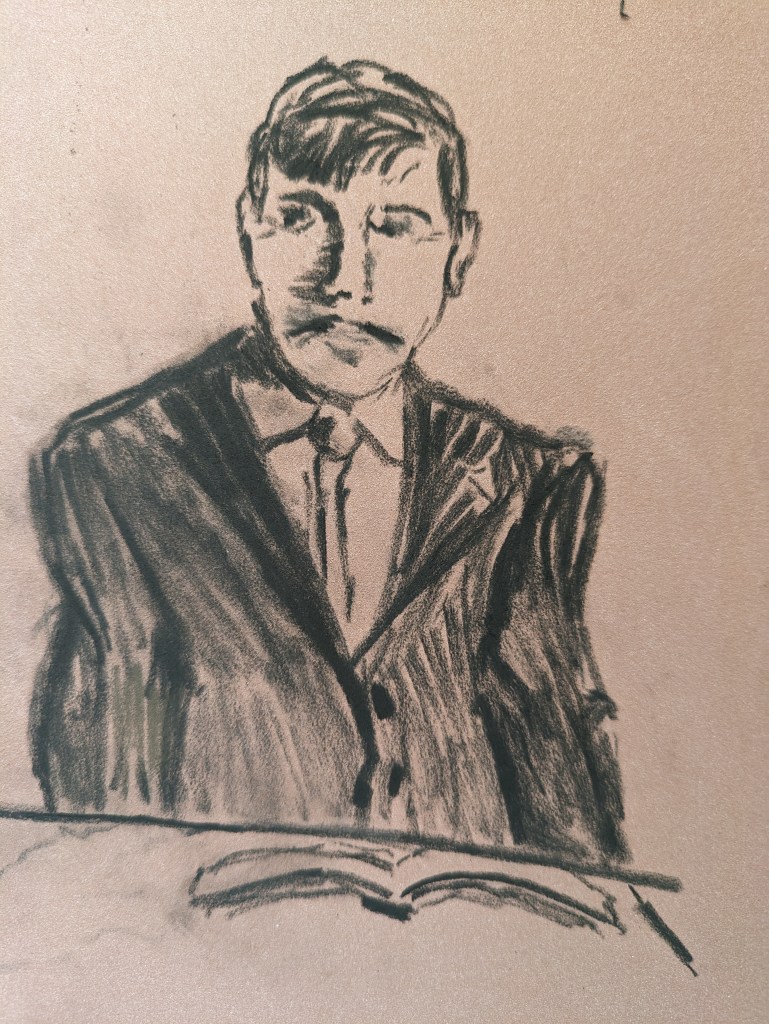
I work at his mouth shaping this more downward. I then add to his hair and put in more definition and shadows to his clothes. The final image is below but for cleaning up.
He looks more serious now and is looking at the couple.
Exercise 2.2 Artists at work
It was good to consider the photographic artist Anthony Cairns and to see how he had really investigated and explored the different elements of the image and how to transpose it onto so many different surfaces as he explored the light. Photography and video is something I will be incorporating into my practice as it’s not only important to take good clear images of my work but I also want to explore how I can utilise video.
I also considered Amy Sillman’s comments. Her approach to colour and testing out almost eradicating and playfully including colours interplaying and pitching them against one another. I appreciate and words she uses about the construction and deconstruction of the colours as her tools. Her approach reminds me of how I am now rubbing in and out my darks and lights and we both eventually arrive at a satisfactory visual outcome. The text came from Painting Beyond Itself, The Medium in the Post-medium Condition. I purchased this book last year and it is so rich in examples of artists describing their work. I hope to use this also as some of my research points.
For the exercise I did research the suggested artist, Agnes Martin. For the information gathered I watched an on line tutorial run by the London Drawing School. I accessed the tutorial via my email link. I also watched a range of other videos. I accessed these on 23/8/23.
https://www.bing.com/videos/search?q=videos+of+agnes+martin&
Agnes Martin was born in 1912 and lived to the good age of 99. She died in 2004. She had a difficult early childhood. Her father died when she was only two or three years old and her mother was reported to be quite a disciplinarian and rather cold. She was Canadian. When Agnes had her tonsils out at the age of five she apparently made her own way to hospital by bus and after two days in hospital she also made her own way home, again by bus. Agnes came late to art as her education led her initially into teaching and she completed a BA in Science. She was aged forty-six when she held her first solo exhibition. It was at this point that Betty Parsons Art Dealer bought a lot of Agnes’s paintings and this enabled her to afford to move to New York. She lived around a community of artists in lower Manhatten. These included Jasper Johns Robert Indiana, Ellsworth Kelly and Jack Youngerman.
The artist suffered from mental health issues and was diagnosed with schizophrenia. In this regard she made work during her well periods. In many ways she was quite a solitary person and her interest in Daoism and Buddhism reflected her minimalist approach in her work. Some of her early work included more abstract organic forms and shapes.
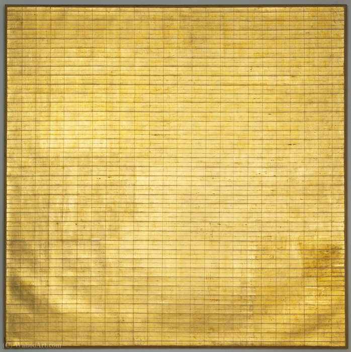
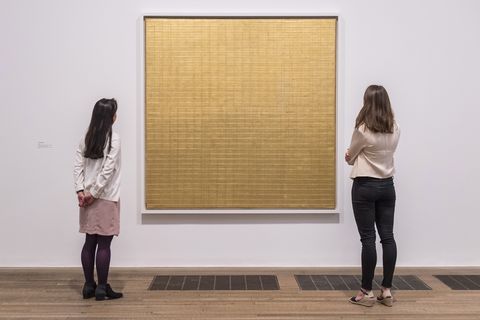
The very famous work below is titled Friendship and it was created through quite an unusual process at the time. The artist would have painted the surface of the canvas in gesso and then she applied gold leaf to the surface. Once this had adhered, the artist started to draw and scratch in the grid lines with a metal tool. There are some overlaps in places on the grid. Some lines in this style were applied in pencil or graphite into paint. She would use her own unique mathematical equation to mark out the grid lines as she wanted them. The processes in a lot of these paintings were the same. Repetition and drawing or scratching into the surface. The application of paint in some of the paintings was often uneven and the grid lines seemed to have been applied with a shaky hand. This however seemed to add to the character of the painting as we see the hand of the artist at work. With some work she would use masking tape to create the lines.
Stripes and repetition are seen again below and her work was all about the emotional response. In this regard her work reminds me of Mark Rothko’s colour fields. She was apparently a huge fan of Rothko’s work and found him inspiring.

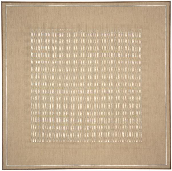
The above work was one in a series of paintings called the Islands. These were all very muted in pale colours.
Mark Rothko is my second choice of artists that really immerse themselves in the process of making. Rothko spent endless hours constructing his colour fields and similarly to Martin his paintings were about invoking an emotional response. Similarly to Martin he also experienced mental health problems. He committed suicide and died in 1970. He was a Russian born American painter and painted and is well known for his colour field paintings. I accessed information about his techniques from the Tate website below in regard to the painting below.
https://www.tate.org.uk/art/artworks/rothko-black-on-maroon-t01031
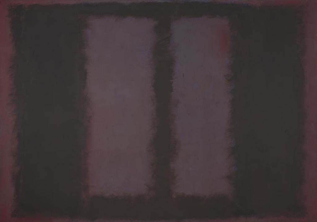
The Tate describe how Rothko would use a single sheet of US cotton cotton that was stretched very tightly over stretcher bars. There was a complicated internally sprung mechanism that kept this taught but there was one screw that prevented the crossed bars from springing out. The can vas would be primed with a base coat of maroon pigment made from powder pigment mixed into rabbit skin glue. Rothko would then add a layer of maroon oil paint that he would apply with a brush and then scrape off to leave an enriched thin layer of colour. Once the surface had dried to a soft sheen he would apply to the edges of the work more maroon pigment but with a subtle mixture creating more depth around the left and right outer areas. He would apply the paint with a huge decorators brush and would lash it onto the canvas. As Rothko added more colour to the edges using stippling and feathering with the brush the paint applied would shrink when dried leaving the translucent sheen. Rothko was fascinated by the light.
There are a lot of artists that are more spontaneous in their application and construction of their work. Helen Frankenthaler was an artist who over the years did change her style and techniques. She was an American Abstract Expressionist painter and lived from 1928 until 2011. She mainly use at the beginning of her career thin oil paints that could run down the page and merge into one another. Paintings were known for their spontaneity. She herself commented that a good painting looks as though it’s happened at once.
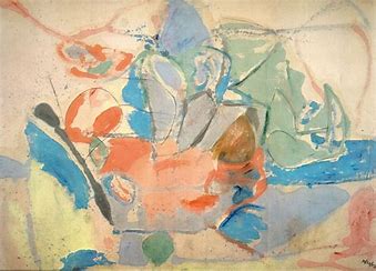
The image above is titled Mountains and Sea and was completed in 1952 early on in her career. She became famous for inventing the Soak and stain technique which was about adding turpentine and pouring very diluted oil paint onto canvas whereby the paint soaked into the canvas and created quite a luminous effect.

This image was titled Canyon and was completed in 1965. At this stage she was
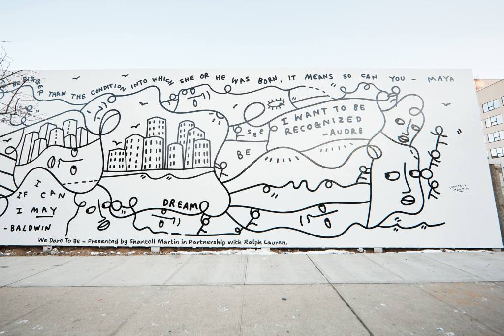
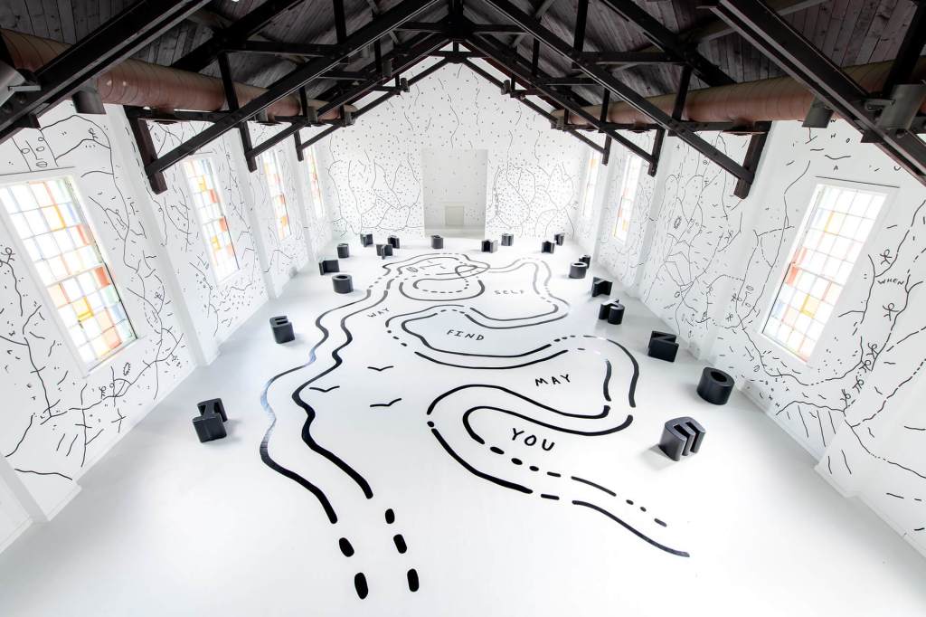
Another more contemporary artist who’s work is quite spontaneous is Shantell Martin, not to be confused with Agnes. The web address is https//stirworld.com/see-features-shantell-martin-on-her-spontaneous-drawings-that-explore-the-issue-of-identity
Martin was born in England but now lives in America. On the website was an audio of the transcript on the page. Her process is to complete drawings from memory or what comes to mind from her experiences and she does this in front of a live audience. She works is black and white creating huge large scale line drawings that invite the audience to engage with the work. She actively questions the audience about what they think of her drawings and actively seeks dialogue about intersectionality, and inclusiveness and identity. Although the page doesn’t state her heritage she is clearly of duel heritage and describes herself as an inbetweener and states.
“I have learned to embrace my multivalent perspectives and double consciousness and to see strength and exalt in my personal and cultural in-betweenness. These lines, shapes and figures are some of those internal dialogues of our shared humanity that I lay bare.” The writer states that her preference of working in black and white is an apt metaphor of her own existence.
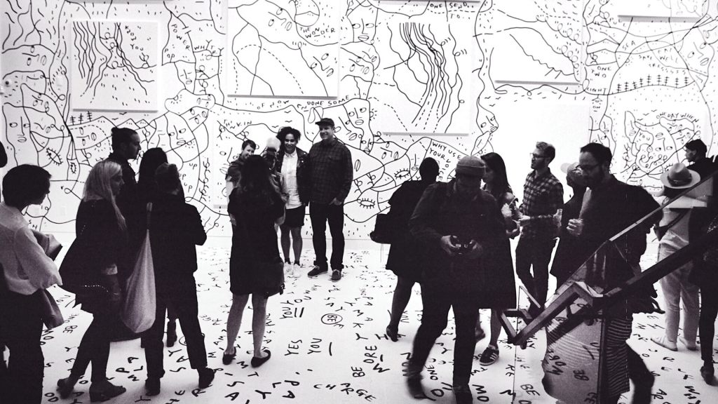
I was quite inspired by the use of text, the playfulness of the drawings but more importantly the interaction with the audience. I recently undertook an interactive painting session to an audience of about fifty people. The completed work is below. I won’t go into great detail as I want to use this for my SYP, but the session went very well and I used a large canvas. Engaging with the audience, albeit on a very different sombre basis will also form part of the YOY exhibition.
As I’ve worked through the materials and our programme everything is structured to help flag up the ideas for work and I feel that I really need time to consolidate more drawings. Drawings and further research will be key to achieving a good standard of work.
Having considered Duncan Moseley’s work I embark on the next practical exercise and probably do this not quite as suggested. I’m still using pastels and a matboard. A friend with a baby has kindly offered to send me several images of her child from birth. The more I draw of her the more I adore this child she is just delightful. I decide to be very rash about colour as in the sets I’ve got of pastels both pencil and sticks there isn’t a flesh colour so I shall overlay and play around with the colour tones. My first sketch is below.
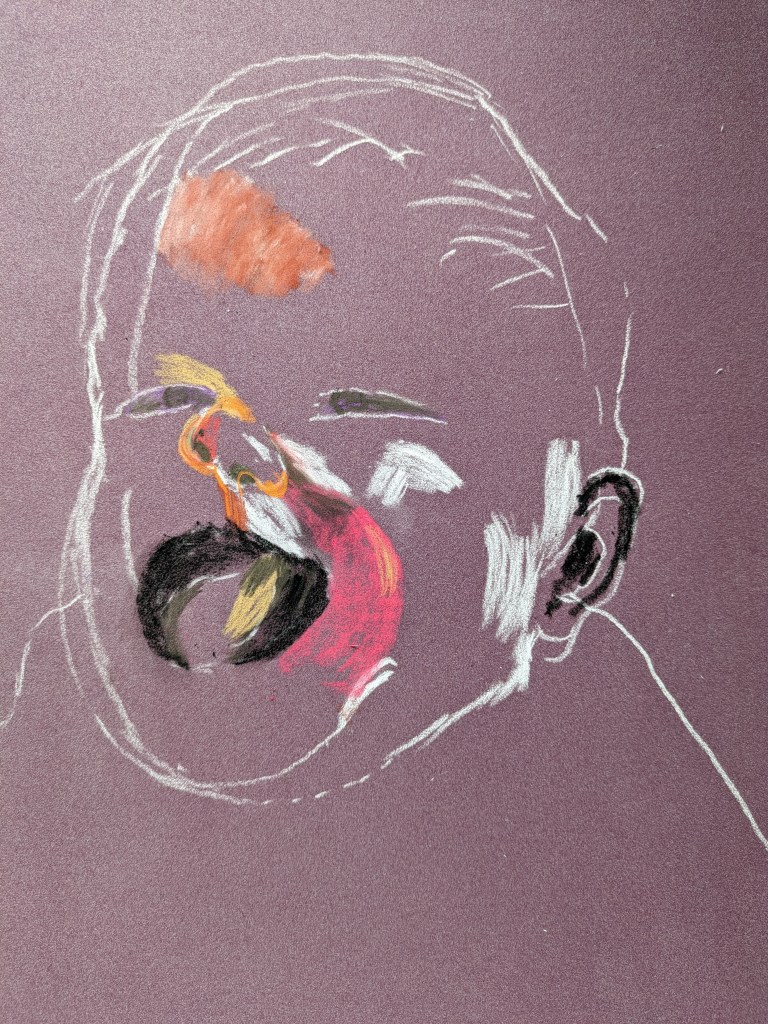
I outline the main shape of her head and then start to put in some colour mainly focussing on the dark and light shapes of her face.
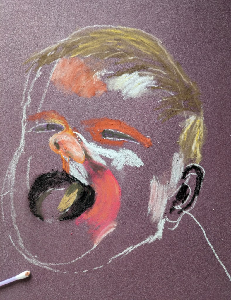
I continue as above putting in some hair and testing out the skin tone. There’s a long way to go but I shall persevere. I deliberately used a dark background to make the face stand out. I work at building up more and more dark and lights in the face. There’s a lot of overlaying colour and rubbing in and out. The next image is almost the final work.
I include the original photo below. I think I have a good likeness but I need to practice a little more
I’m not after exact great portraits but I’m conscious I need to draw something real! I can see how the hairline and forehead are not tilted back enough but this is practice. I shall do a little more on this.
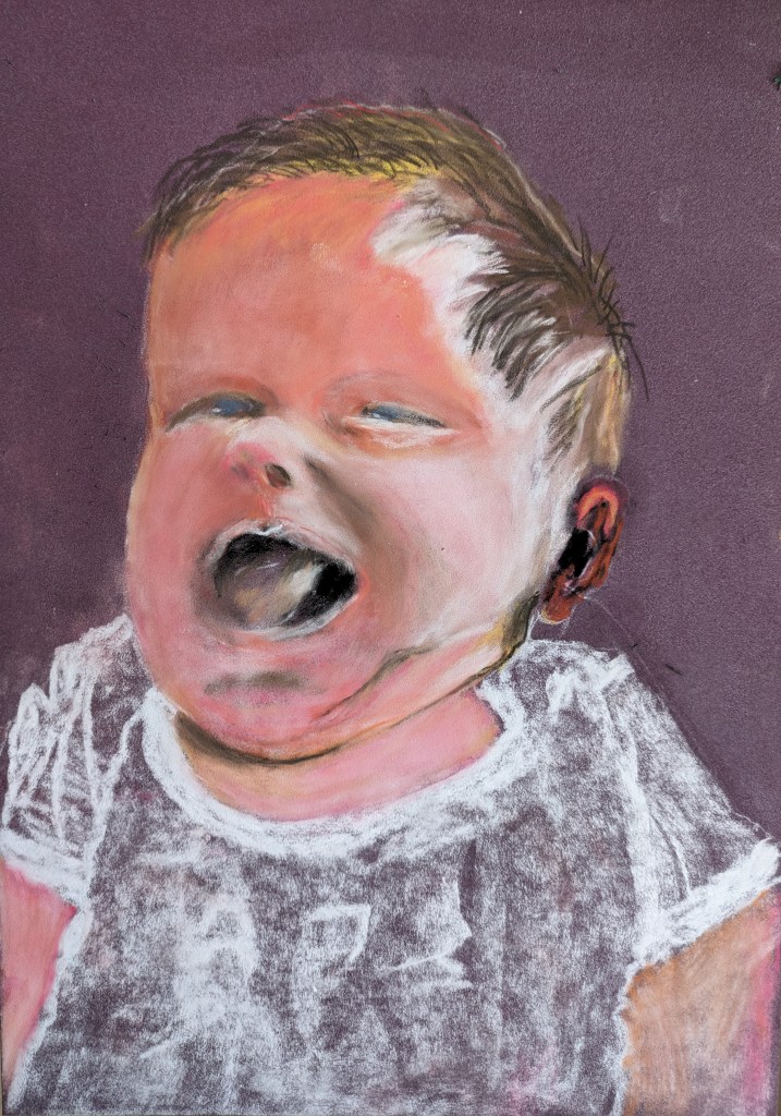
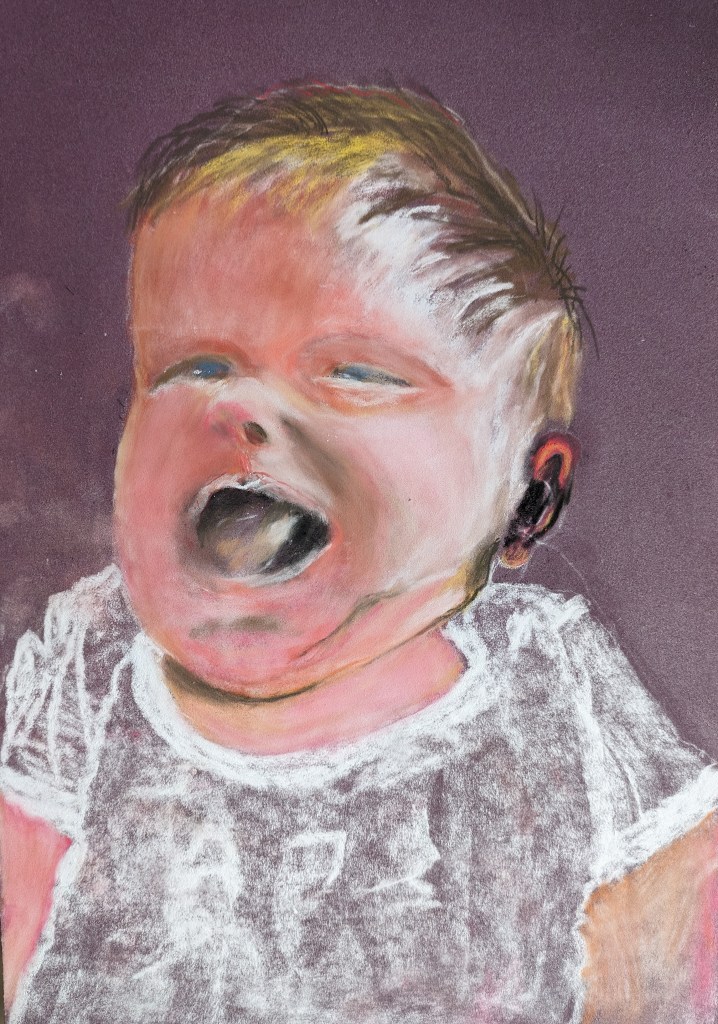
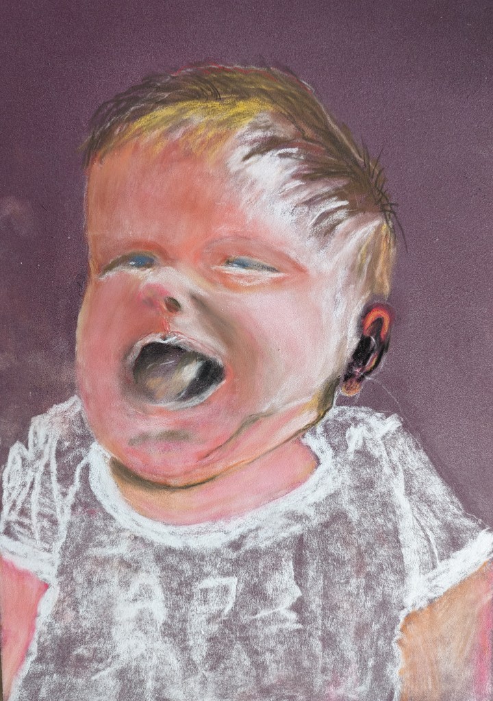
I adjust the hairline and add a little more hair on the right. I also adjust the ear. It’s not perfect but I will leave it there as there’s a danger I will spoil it. Her eyes are not quite right the one on the left needs adjusting and the shape of the eye needs attention on the right.
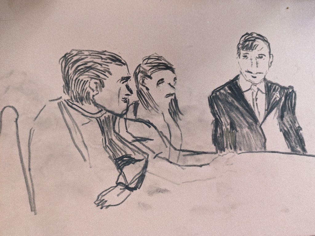
My next drawing is a return to one I started. A potential meeting. I’ve been looking at courtroom sketches and drawings for this sketch and this I will also add to my research. Courtroom drawings do add and capture the drama of a scene. The artists draw quickly and can use a range of materials including pastels acrylic and watercolour.
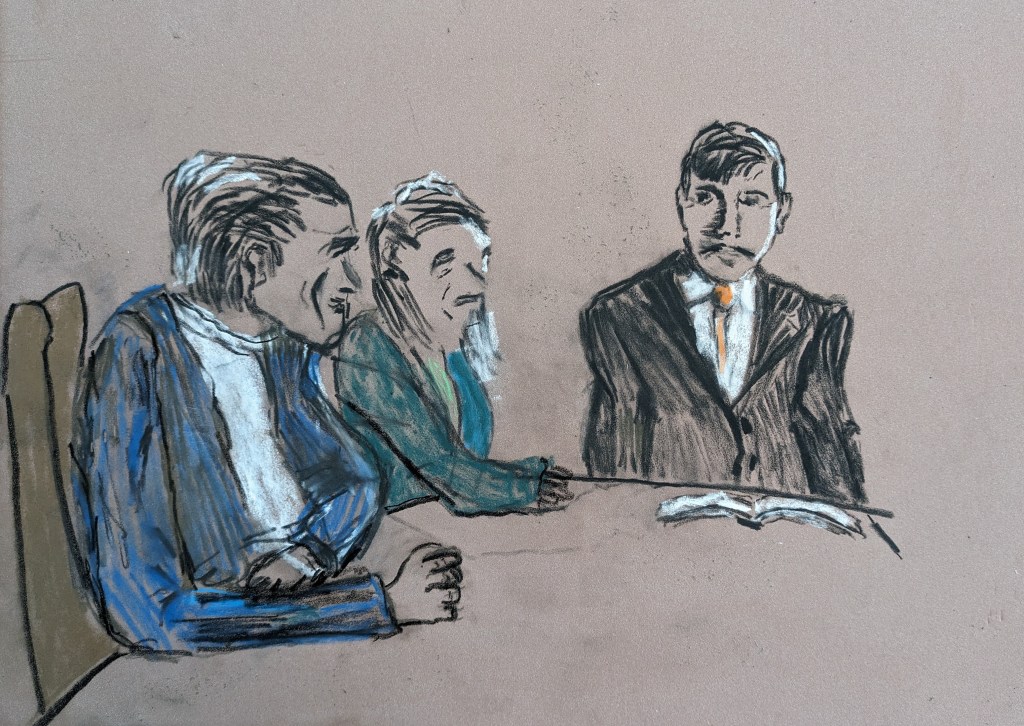
This was where I left this drawing but this one doesn’t show the additional work on the manager. The arm ology needs some attention!

The more drawings I do the more research comes to mind. We have had the recent deaths of the babies in hospital. I’m also going to use in my research Barbara Hepworth’s hospital drawings. I came across these earlier on the course and have researched her a while ago. It will be relevant to revisit these too.
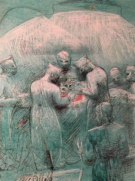
The above images are from my own resources so will eventually have to ascertain details of their source. These are just fabulous drawings almost in monotone. The light falls on the figures well but I’m not sure that the light sources above could be defined as lighting. The green in the lamps could have been darkened more rather than just an outline.
Back to my image and considering courtroom drawings for this image. I start to build up my colour in the people and define better shaping of limbs and hands.
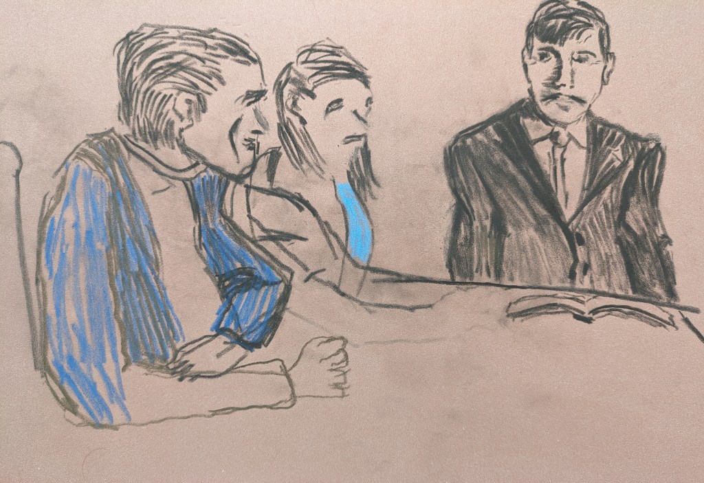
As I start to build up the figures on the left I just go for it with colour and lines and shapes. I messed up a little on the space in between the figures and getting the arms right but I come back to this as you see.
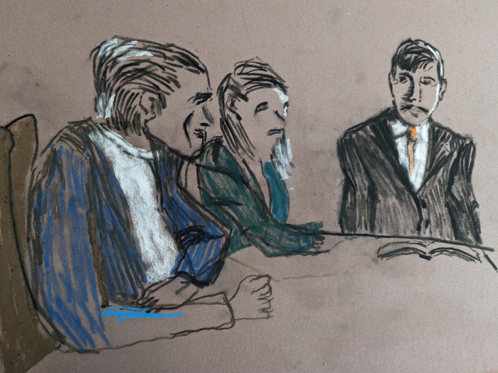
The arms are a little better but I need to be mindful of foreshortening!
I’ve added more colour to all of the figures and some of the shaping is better. Below is the internet image I used as my basis for the drawing.

I used mainly the three figures on the left for outlines and shapes. The drawing isn’t perfect and some of the lines of errors I couldn’t fully erase. Overall I’m reasonably pleased with the start I’m making and I’m looking forward to getting more drawings done. I’m not afraid any more when the charcoal, pastels or paint hit the canvas and the erasure and drawing or scratching in really works for me.
